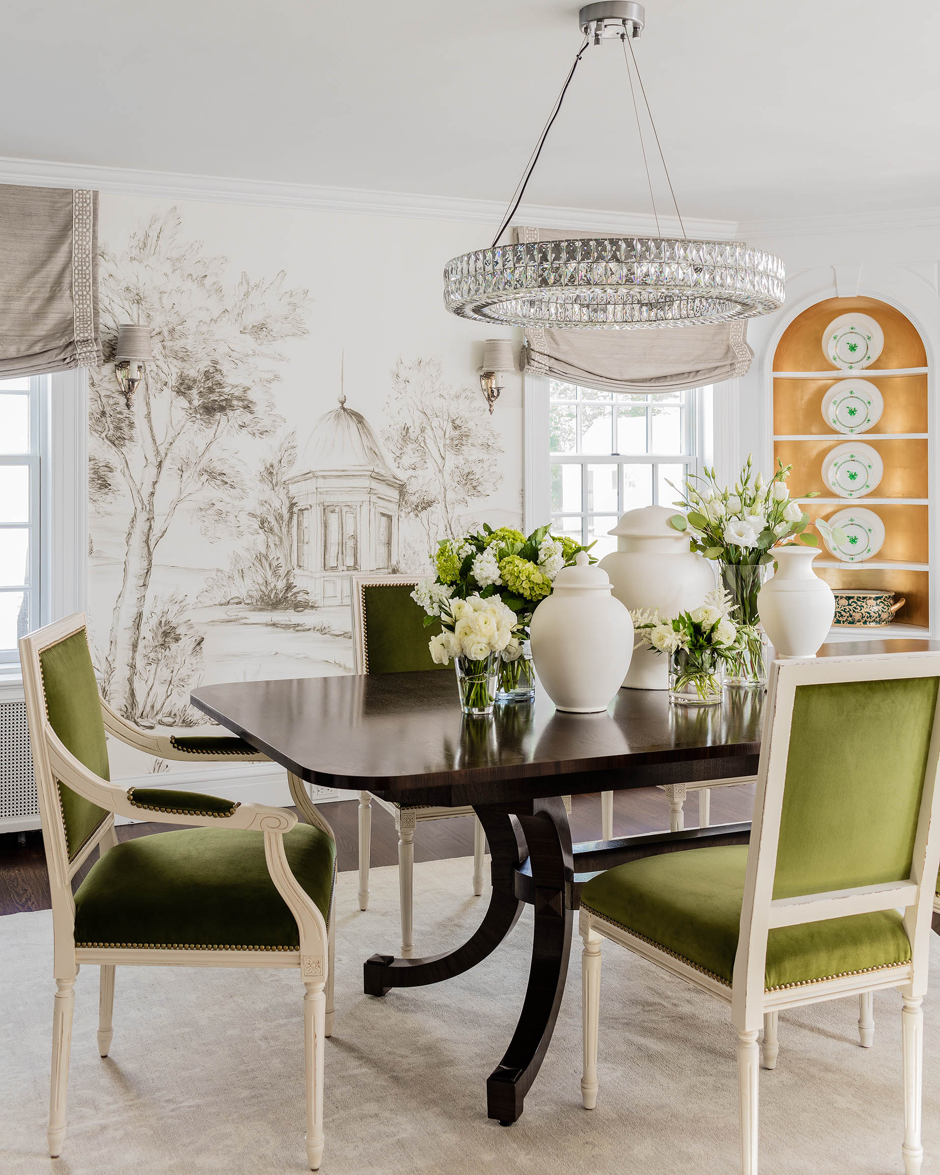

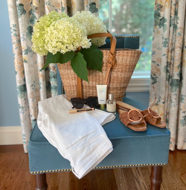
Fashion Friday: Neutrals & Chartreuse
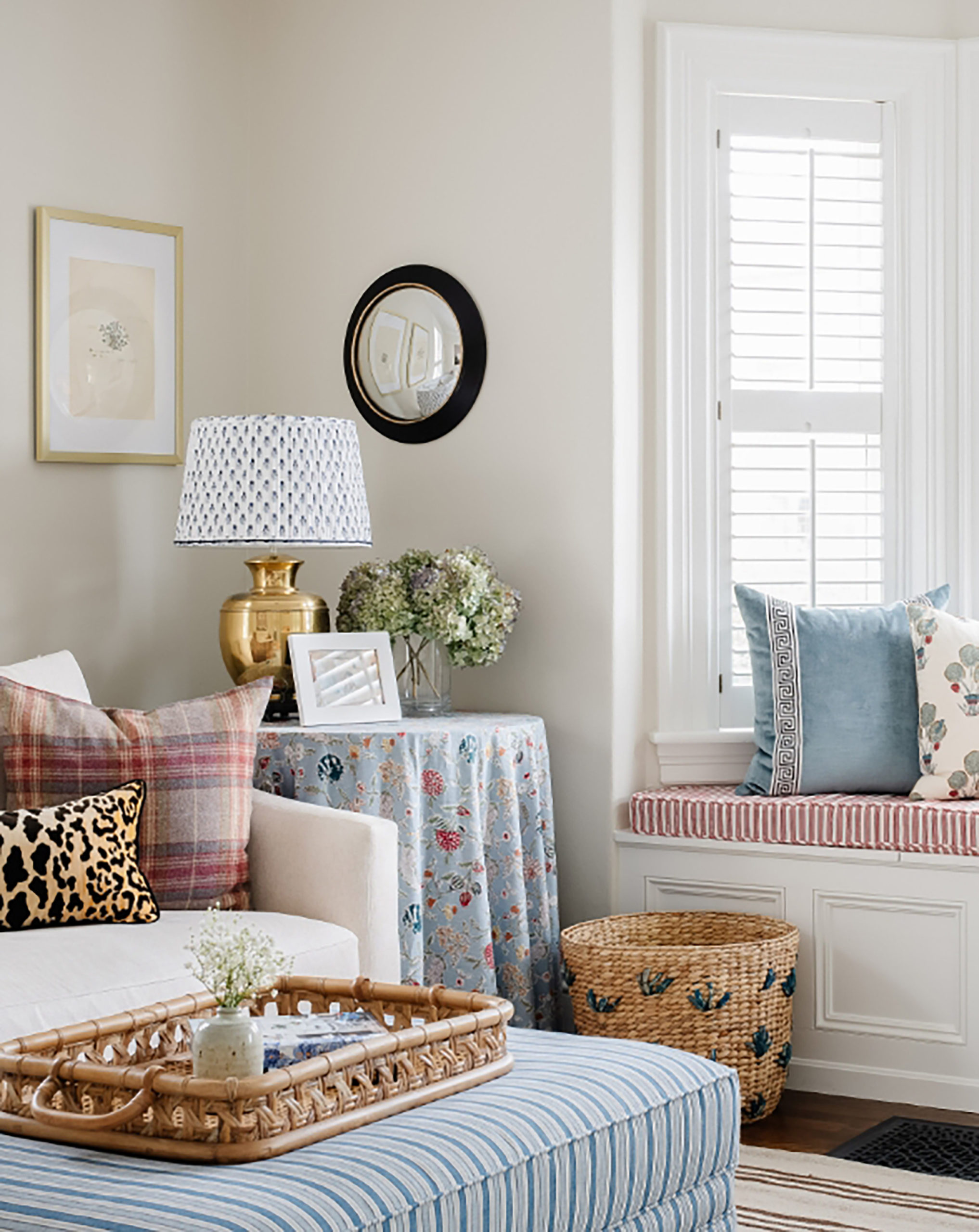
Some of my favorite interiors of all time have a dose of chartreuse. It’s a hard color to nail, but when you do, it’s magical (for example check out Ashley Whittaker’s house in NY) It’s so good paired with rich neutral hues, deep plums, pale blues and animal prints, specifically leopard. I also love this combo in fashion as well! So here are some fun finds that blend the palette together for your closet!
Also, a reminder that with this new site is a new way to easily shop favorites of mine in fashion, decor and other categories- click on the SHOP tab up top and you’ll find updated links to items in posts and just random favorites!
ExploreEnjoy More
Browse:

I’m just about to paint my upstairs hallway chartreuse. I’ve hung a couple of artworks in the hallway that have chartreuse in them along with the main colours of the three rooms off the hallway. In turn, each of the three rooms will have something chartreuse (some pillows, an artwork, some porcelain) to tie the hallway and the rooms together.
Love your color palette but for me, I’d sub in a rich coral. Citrine won’t work for me, but coral (also a snappy accent) will. Enjoyed looking at your inspiration house.