INTRODUCING ERIN GATES x A STREET PRINTS WALLPAPER!
I am so proud and excited to share with you that my wallpaper collection with A-Street Prints is now officially available! Creating a wallpaper collection has always been a dream of mine, and I am so thrilled with how this first collection turned out. I was also thrilled to work with Brewster, a local company to Massachusetts and long standing pillar in the wallpaper industry. They were so supportive and really let us have full creative control of this line, which is so appreciated. Read more about the inspiration and process for the collection on the A Street Blog.
We worked with artist Rachel Rogers to bring my initial concepts to life (I discovered her when I chose one of her designs for Emma’s birth announcement), and ended up with 8 patterns, all named for people & places that are important to me and my team. As with most of my design work, this collection is rooted in traditional New England classicism, with modern updates to make it more appealing to different design styles.
Here they are!
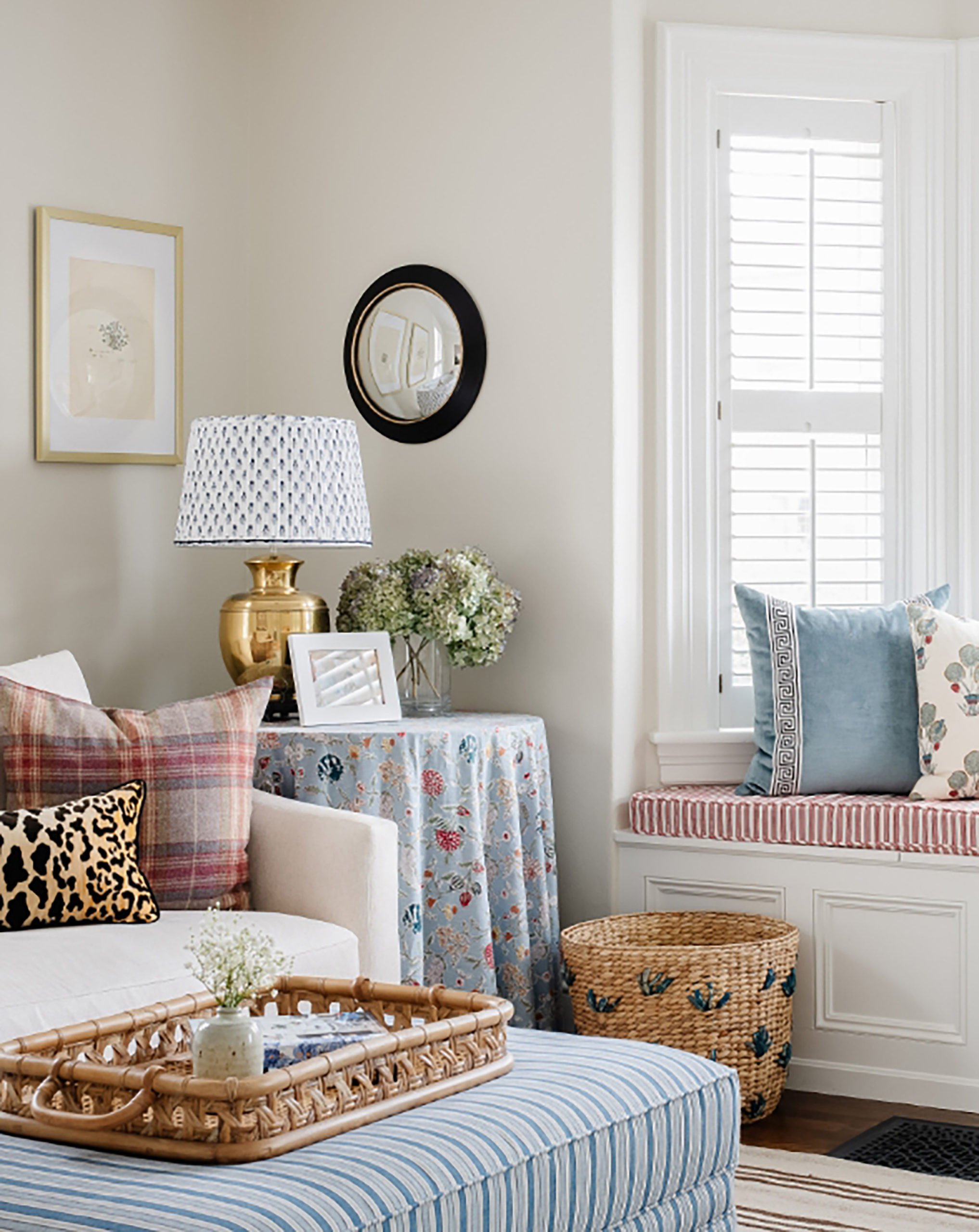
(All imagery is courtesy of my photographers Michael J. Lee, Sarah Winchester and Jessica Delaney, and got a little digital makeover with the papers!)
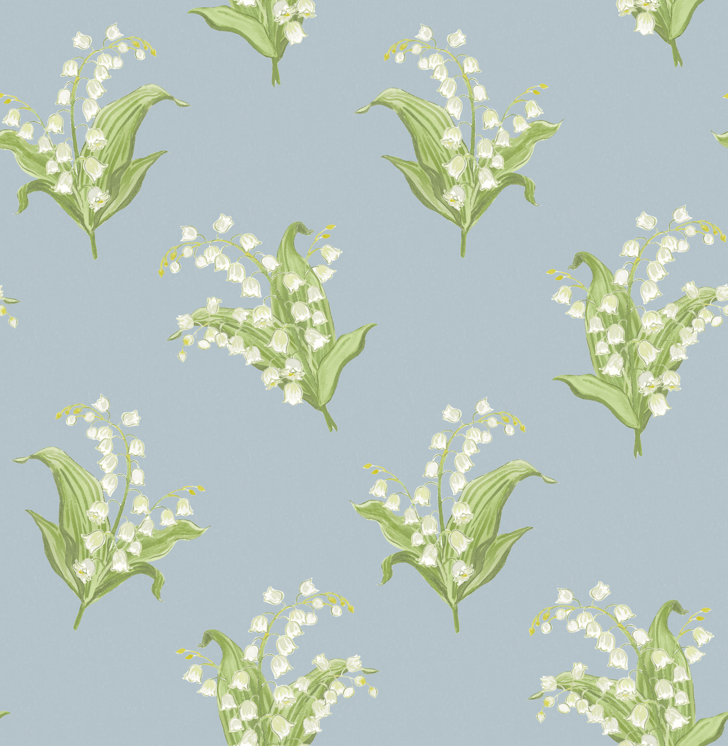
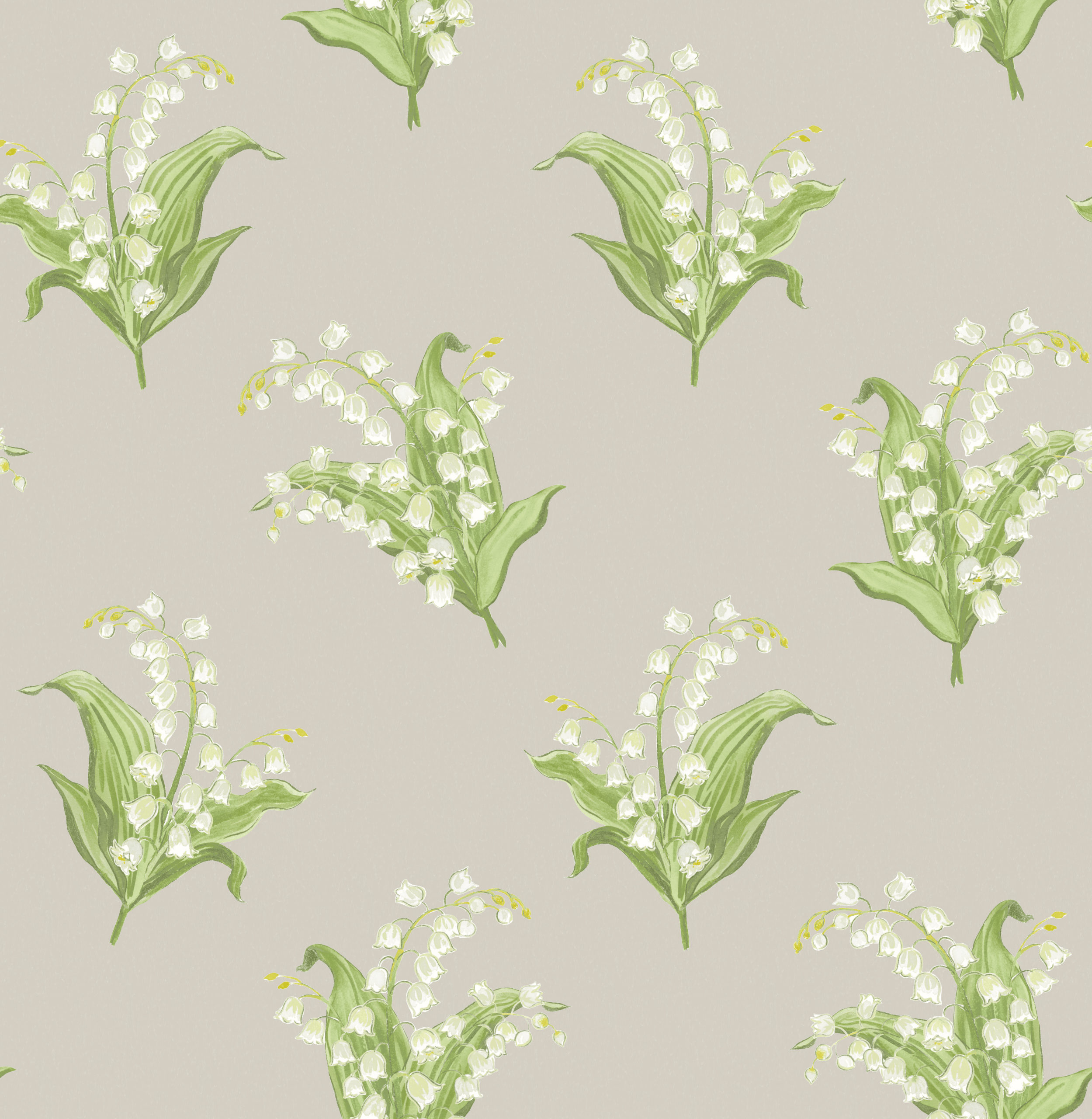
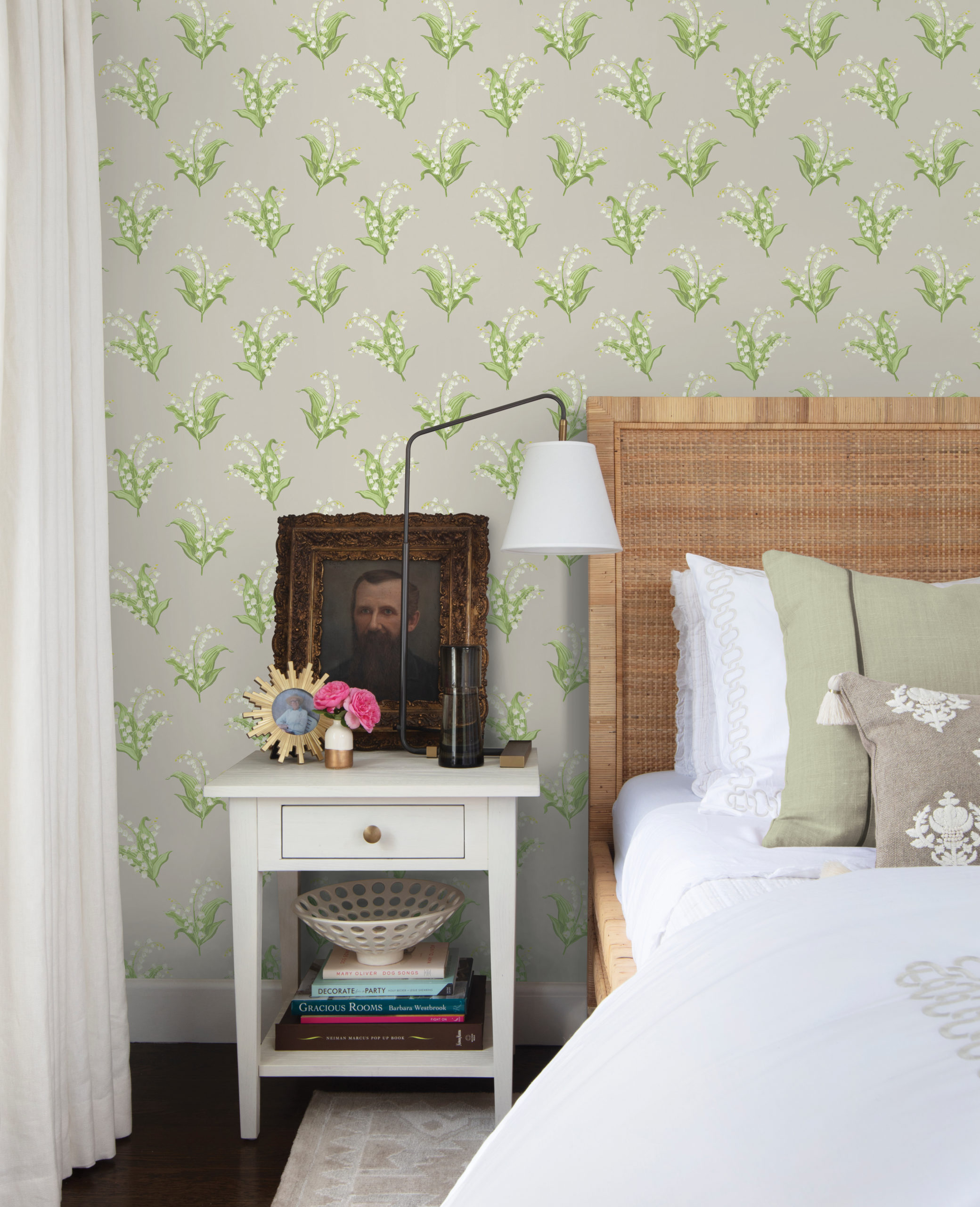
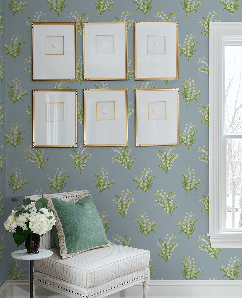
FARMINGTON
Oh, how I love this design! Probably my most favorite of the collection. The lily of the valley pattern is based on the old floral wallpapers found in the dorm rooms at Miss Porter’s School, which is a very special place to me and my most formative experience in life. It’s such a classic – at once nostalgic and refreshing. If I had not already wallpapered Emma’s room I would have 100000% used this. Who knew I’d have my OWN line?!?!
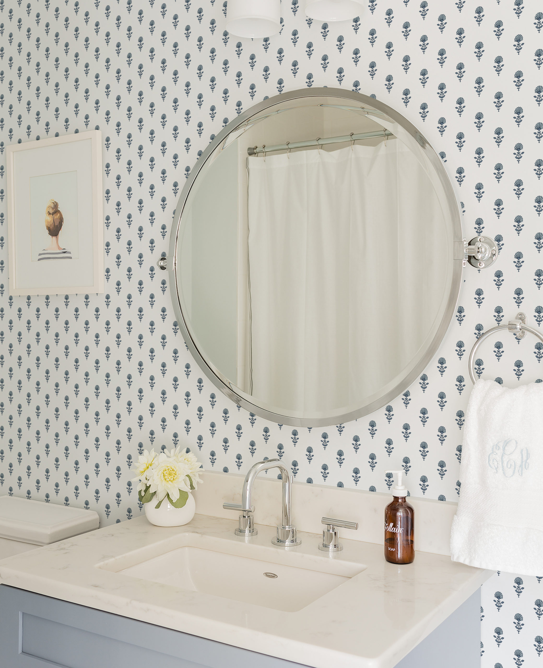
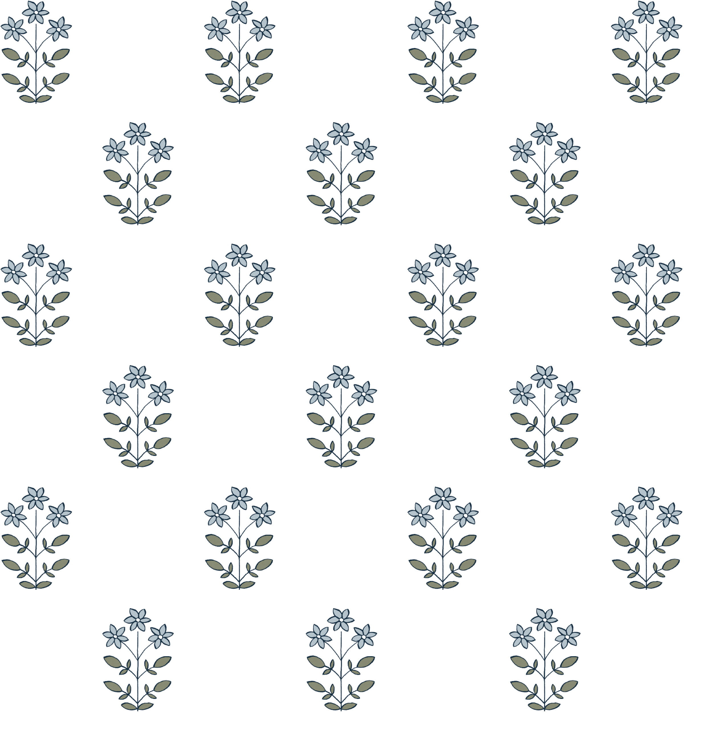
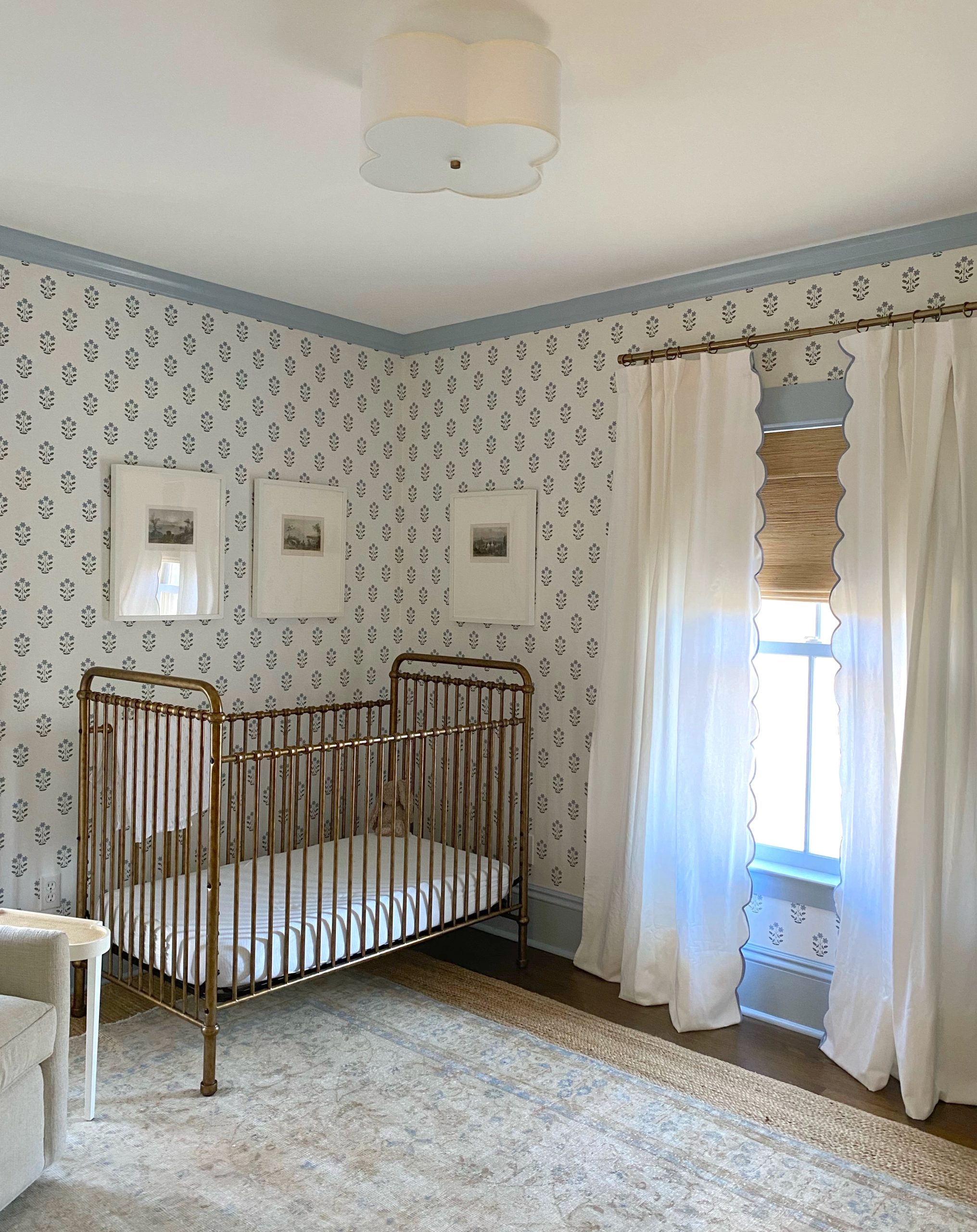
LIBBY
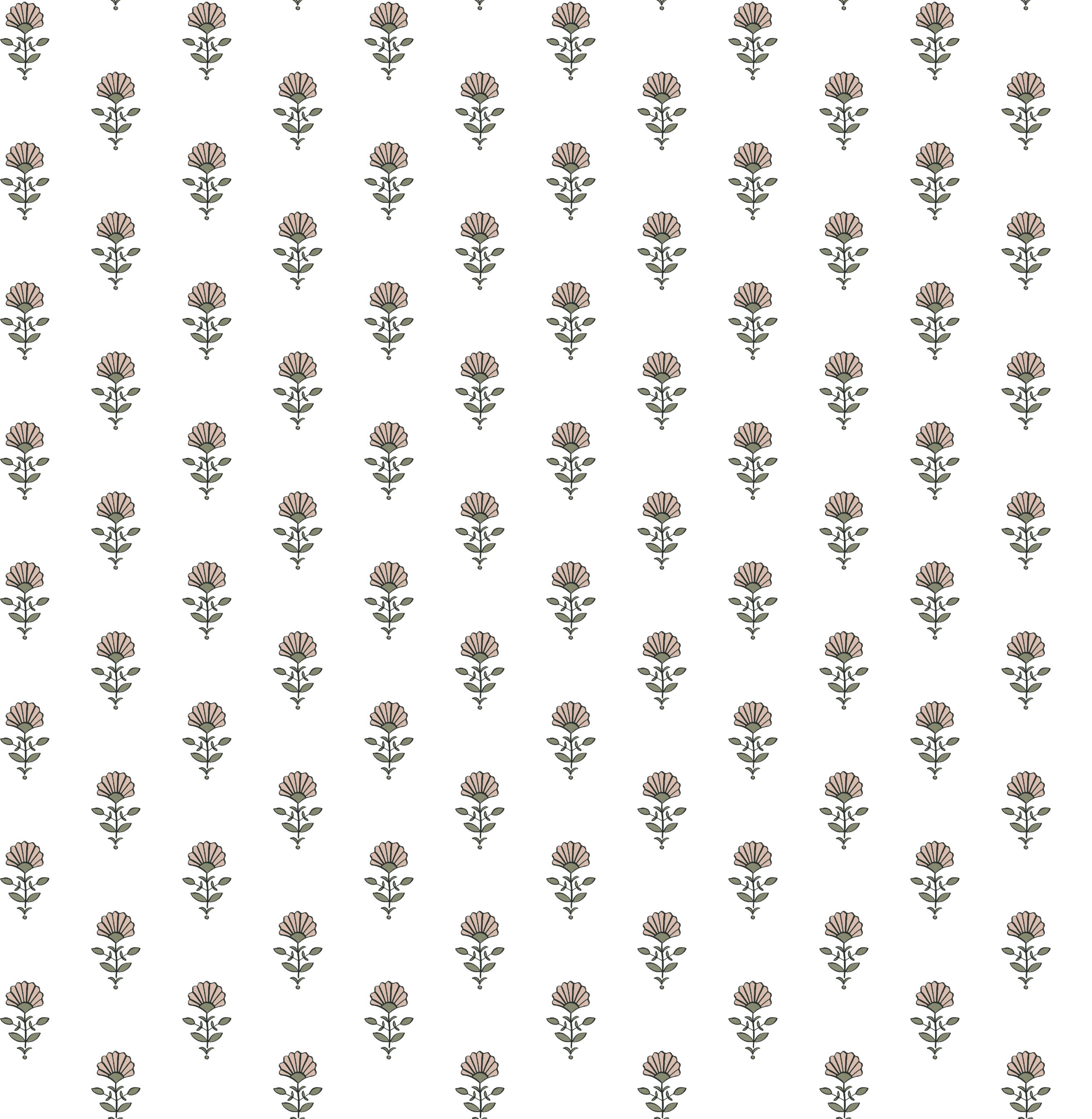
The Libby is a small-scale floral block print that isn’t too precious, but keeps it interesting with little details. Perfect for a powder or bedroom. Named after Andrew’s darling grandmother who loved gardening.


RHYS
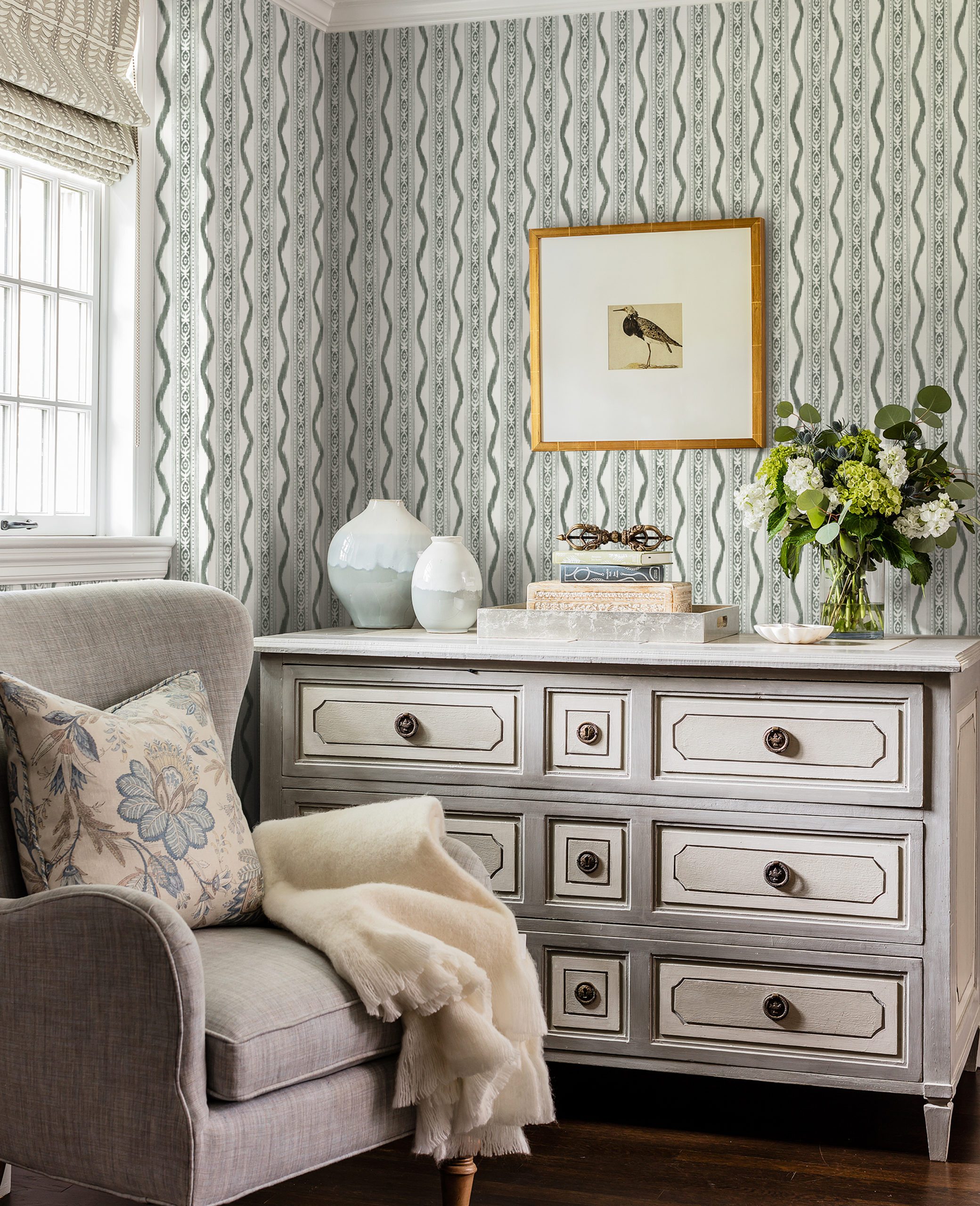
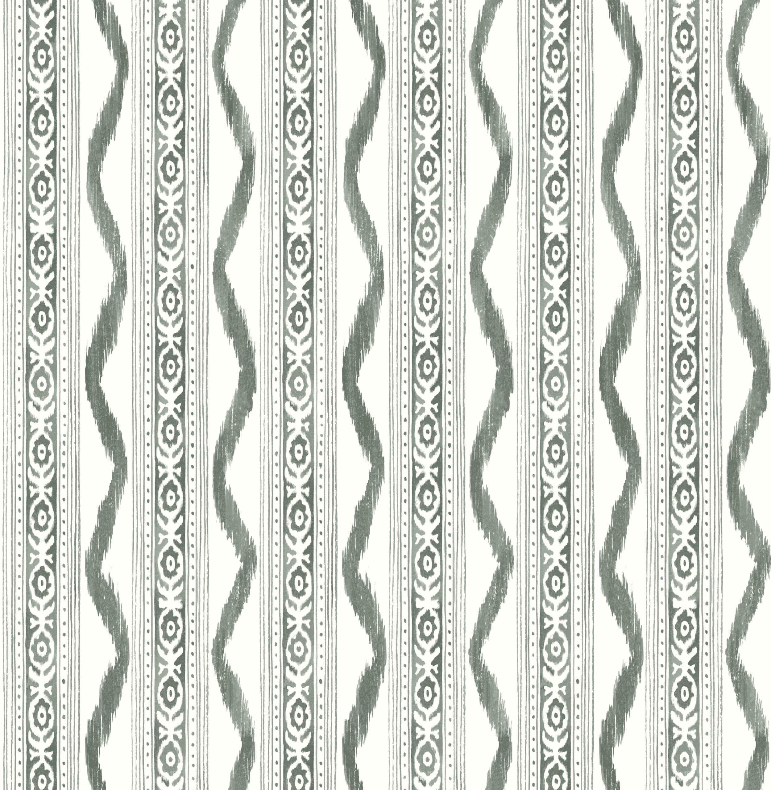
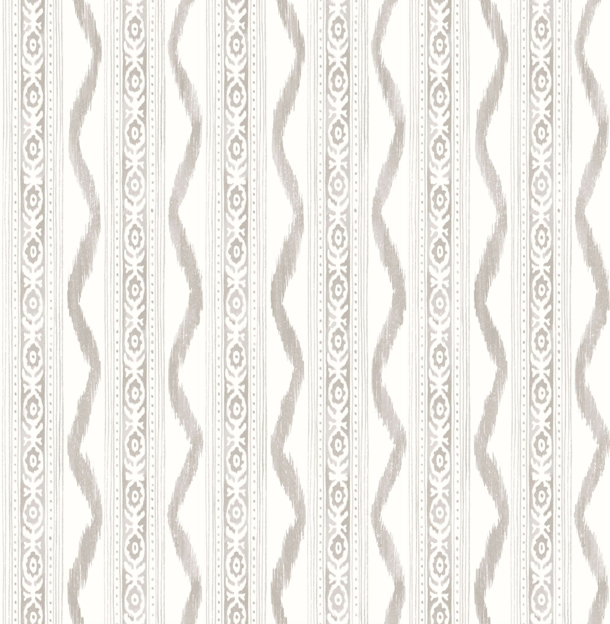
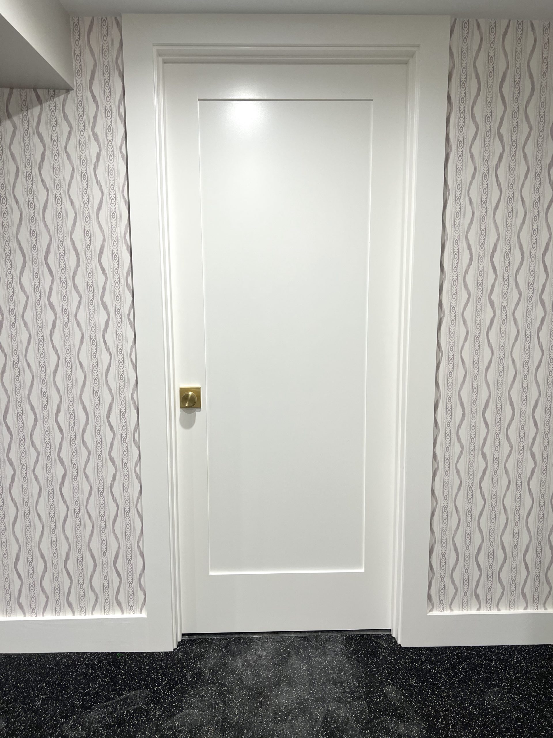
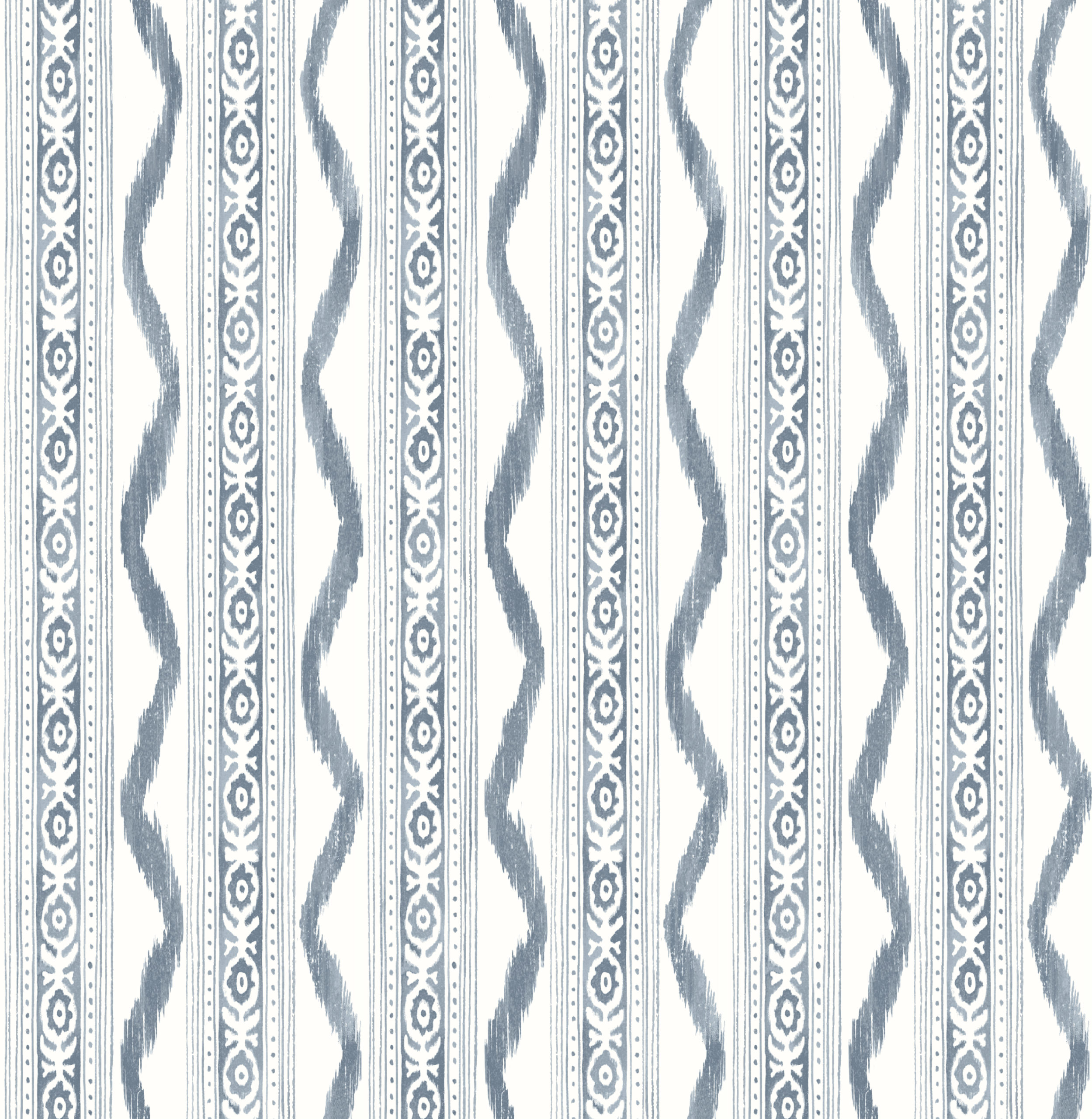
An update to a classic, time-tested, designer-favorite ikat pattern, combining painterly stripes and intricate block printing detail. I used the Stone colorway in my gym – it’s the perfect not-too-gray-not-too-beige neutral. Named after the son of my Director of Branding/Marketing (who championed bringing this collection to life).
HENRY
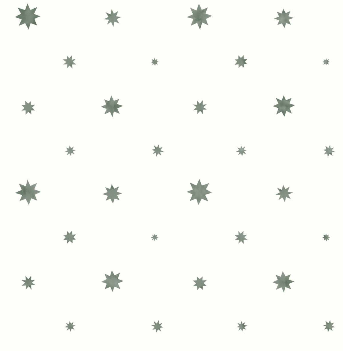
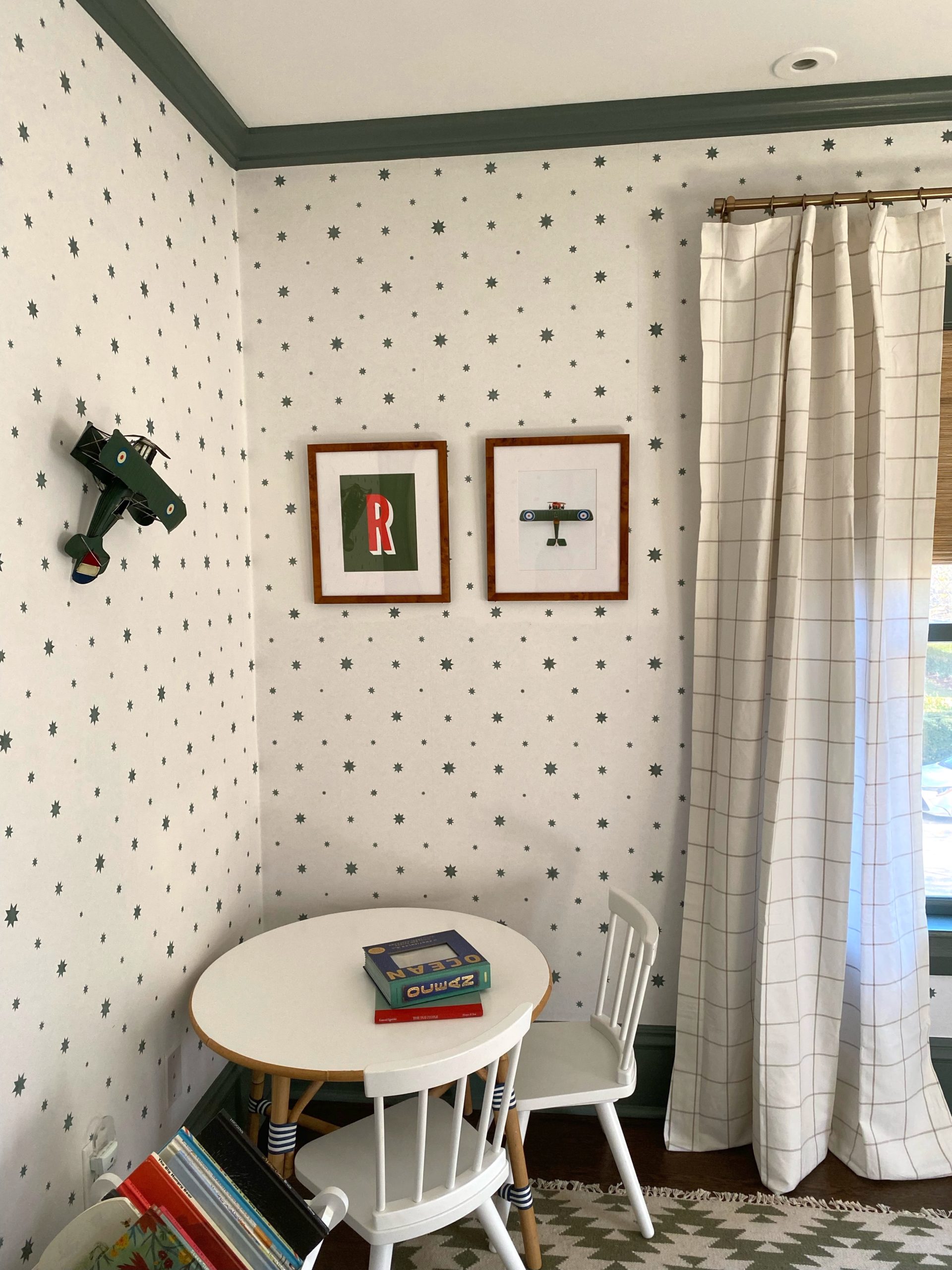
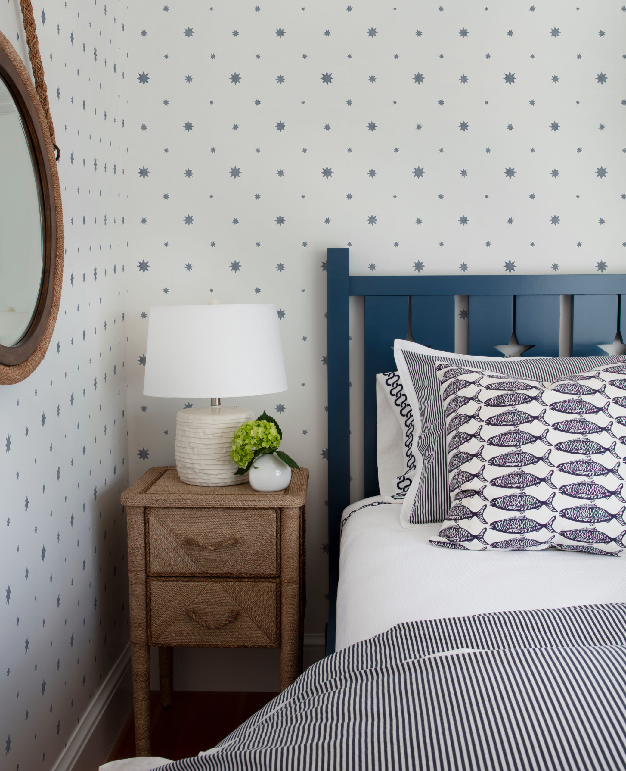
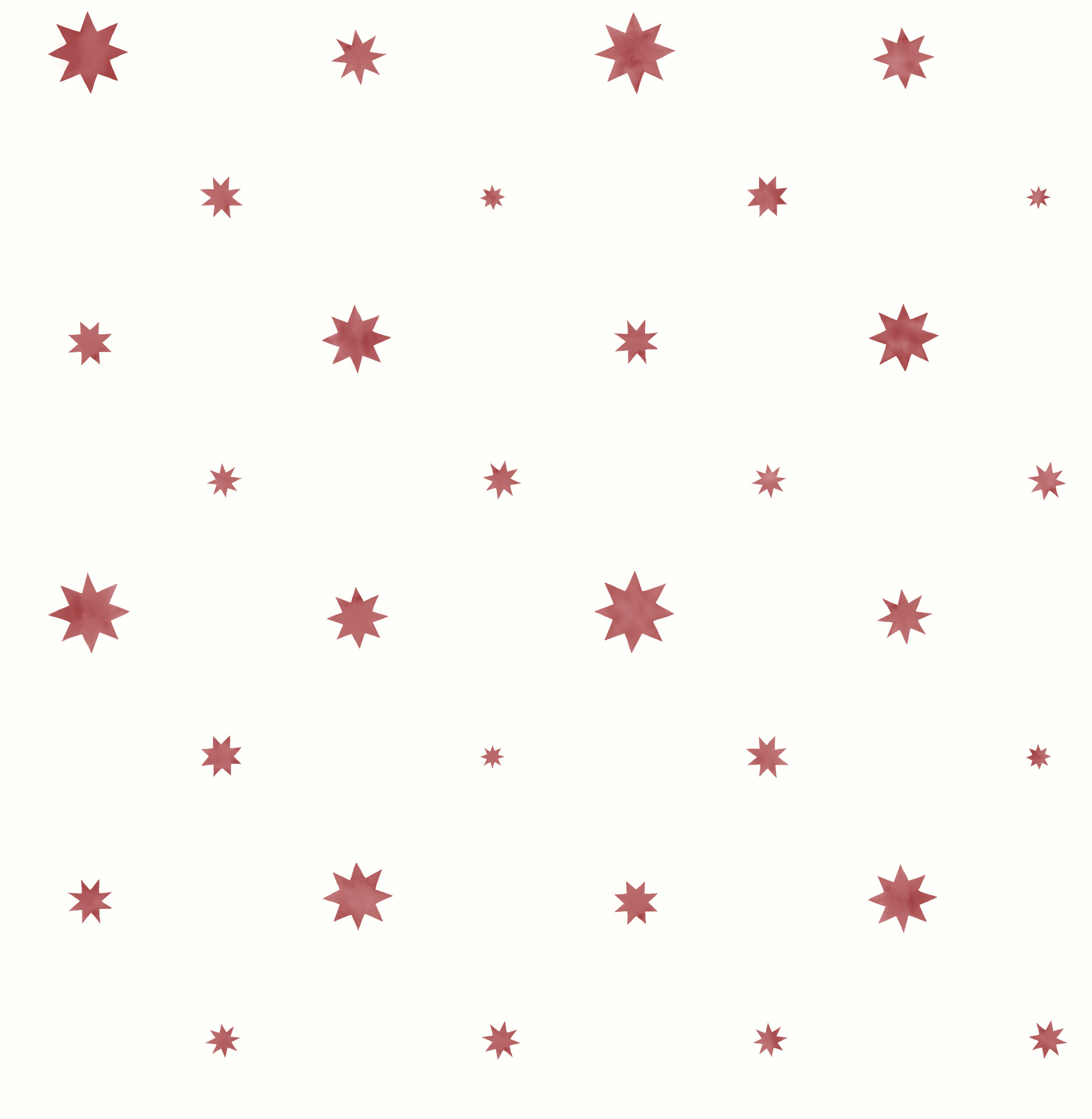
We all know who inspired THIS one… my own little star. I knew from the get-go I wanted some kind of star paper, but I wanted to vary the size and tone and make sure it had a hand-painted feel. I LOVE the hunter green and neutral versions, which you can’t find elsewhere. This would be especially gorgeous on a ceiling! We were lucky enough to get a few rolls in advance of the launch, and the Henry in Green is now living in Molly’s son’s room, looking so adorable (the trim is painted “Green Smoke” from Farrow & Ball, and is a perfect match). I’m also putting the red version inside Henry’s closet!


KIT
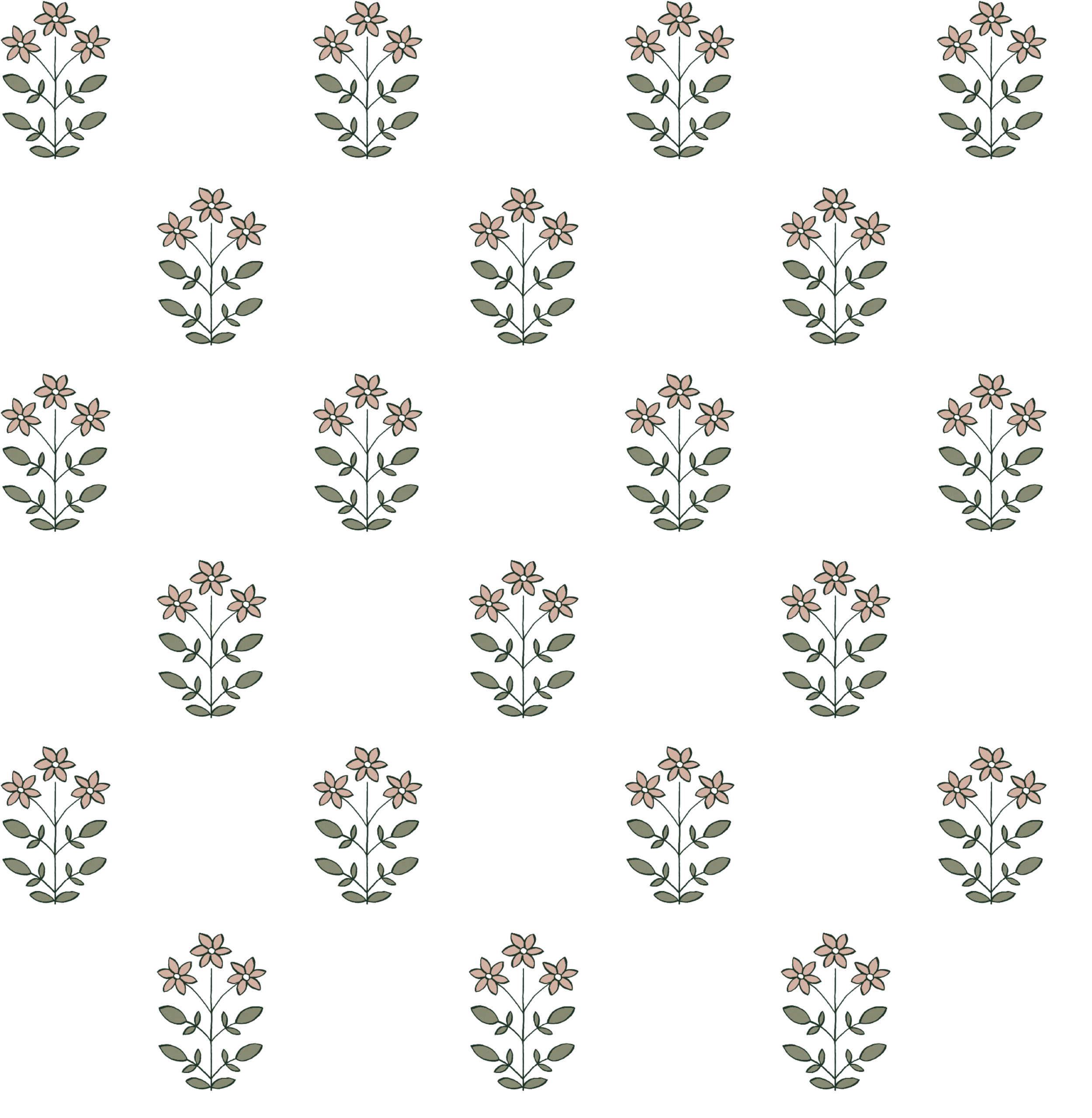
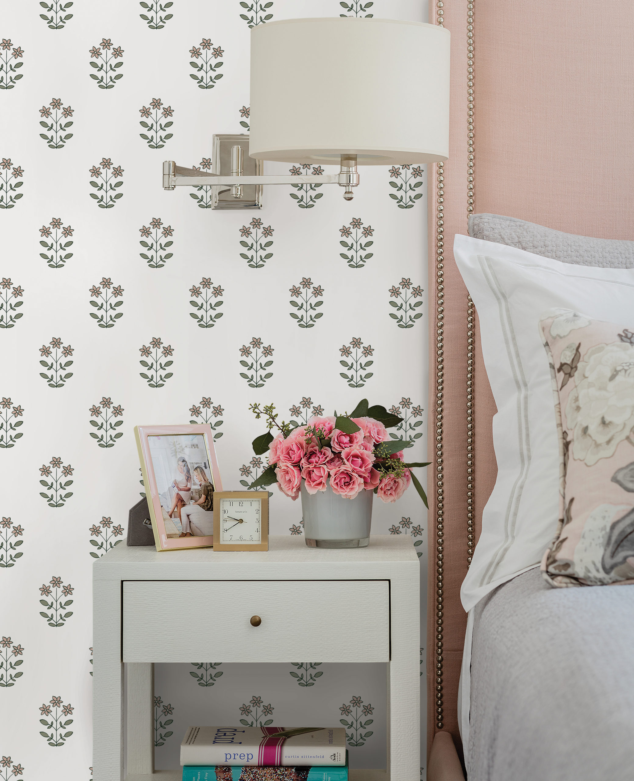
This pattern was inspired by both my love for florals and traditional Indian block printed textiles. I wanted it to have a crisp feel, but read as almost a paisley from far away. Named after, and in the room of, Molly’s daughter. I’m particularly in love with the red and pale blue colorway.

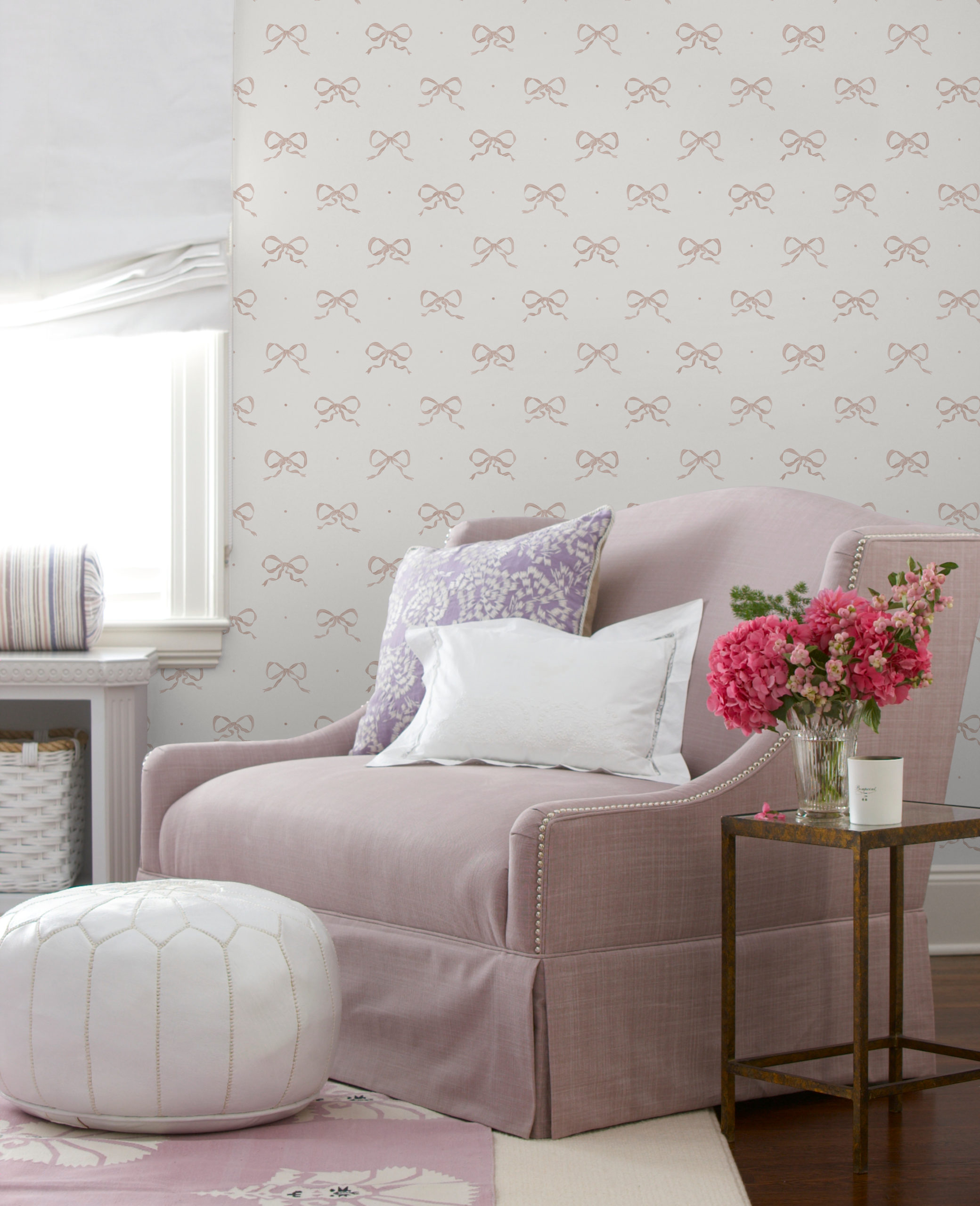
EMMA
Named after my sweet girl, this pattern is both sweet and simple. I absolutely love the tiny details and loose feel of each bow (you’ll notice there are a few different versions within the pattern). I’m using the stone colorway inside Emma’s closet, which is going to pair SO amazing with her Bowood wallpapaper.



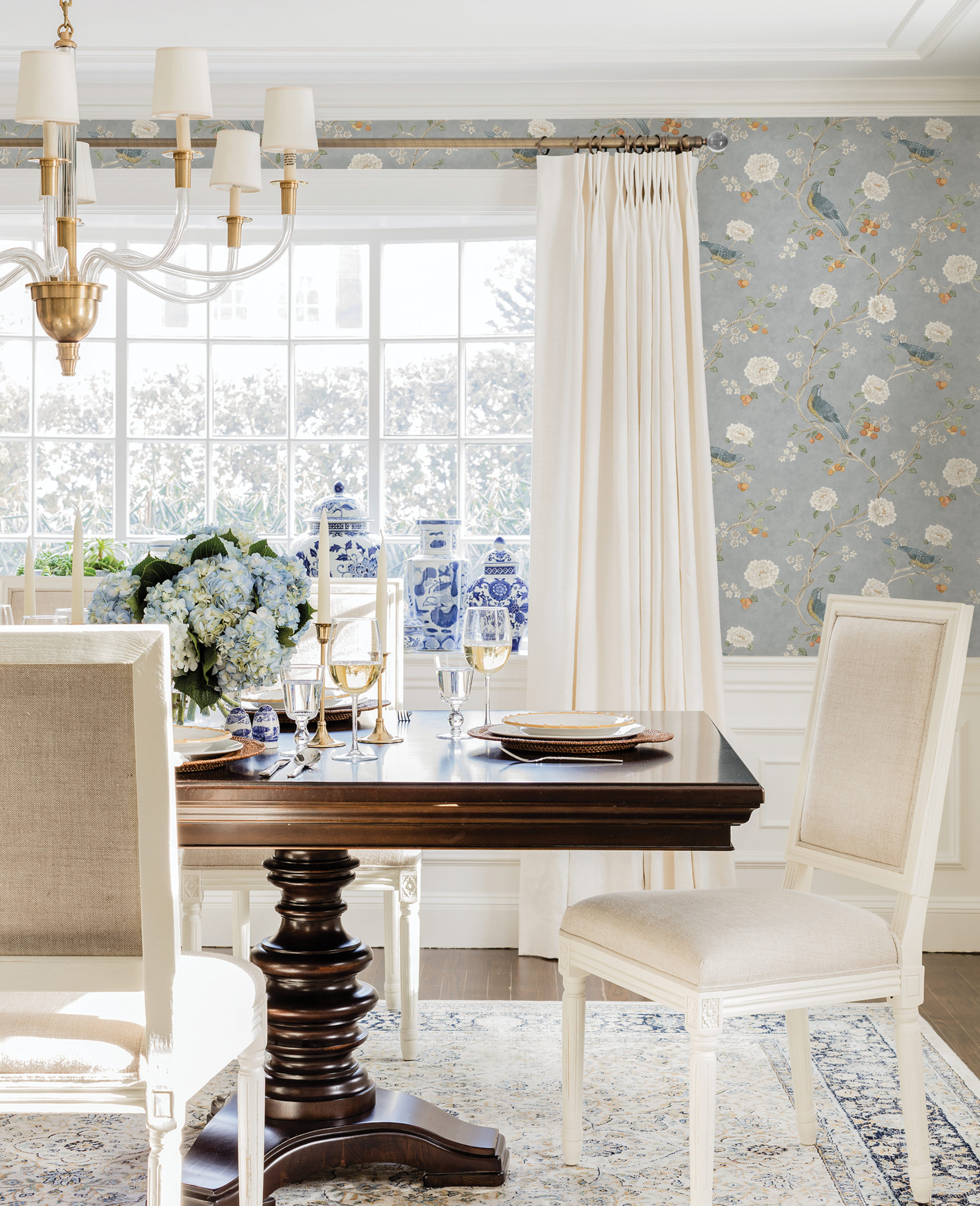
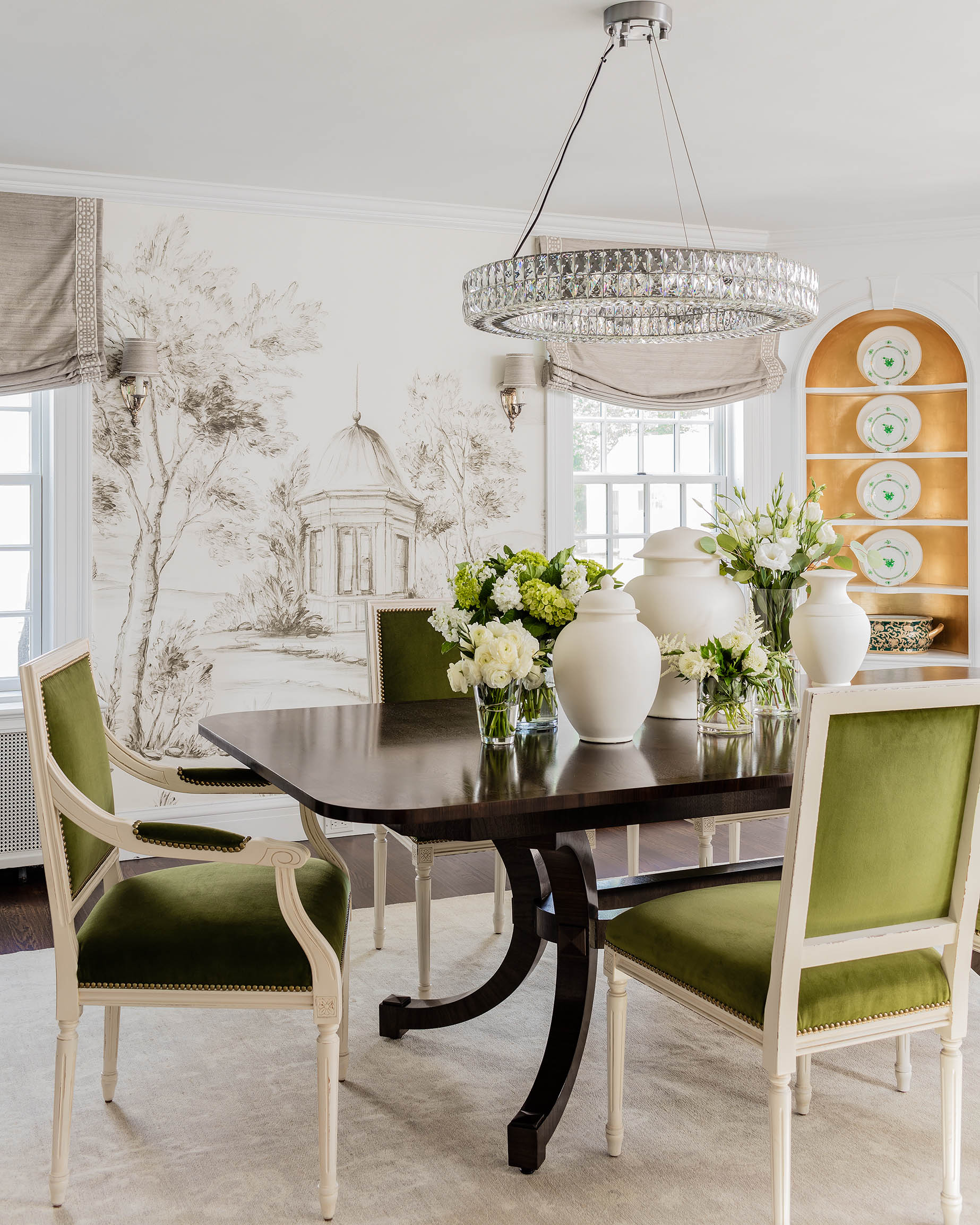
WELLESLEY
Creating this one was so fun! Artist Rachel Rogers painstakingly hand-painted this Chinoiserie design, featuring subtle nods to my life, including the state flowers of Massachusetts and Connecticut (Mayflower and Mountain Laurel), tiny ladybugs (the Massachusetts state insect, did ya know?) and birds in my favorite shades of blue. This would coordinate with green, blue, burnt oranges and neutrals – lots of options.

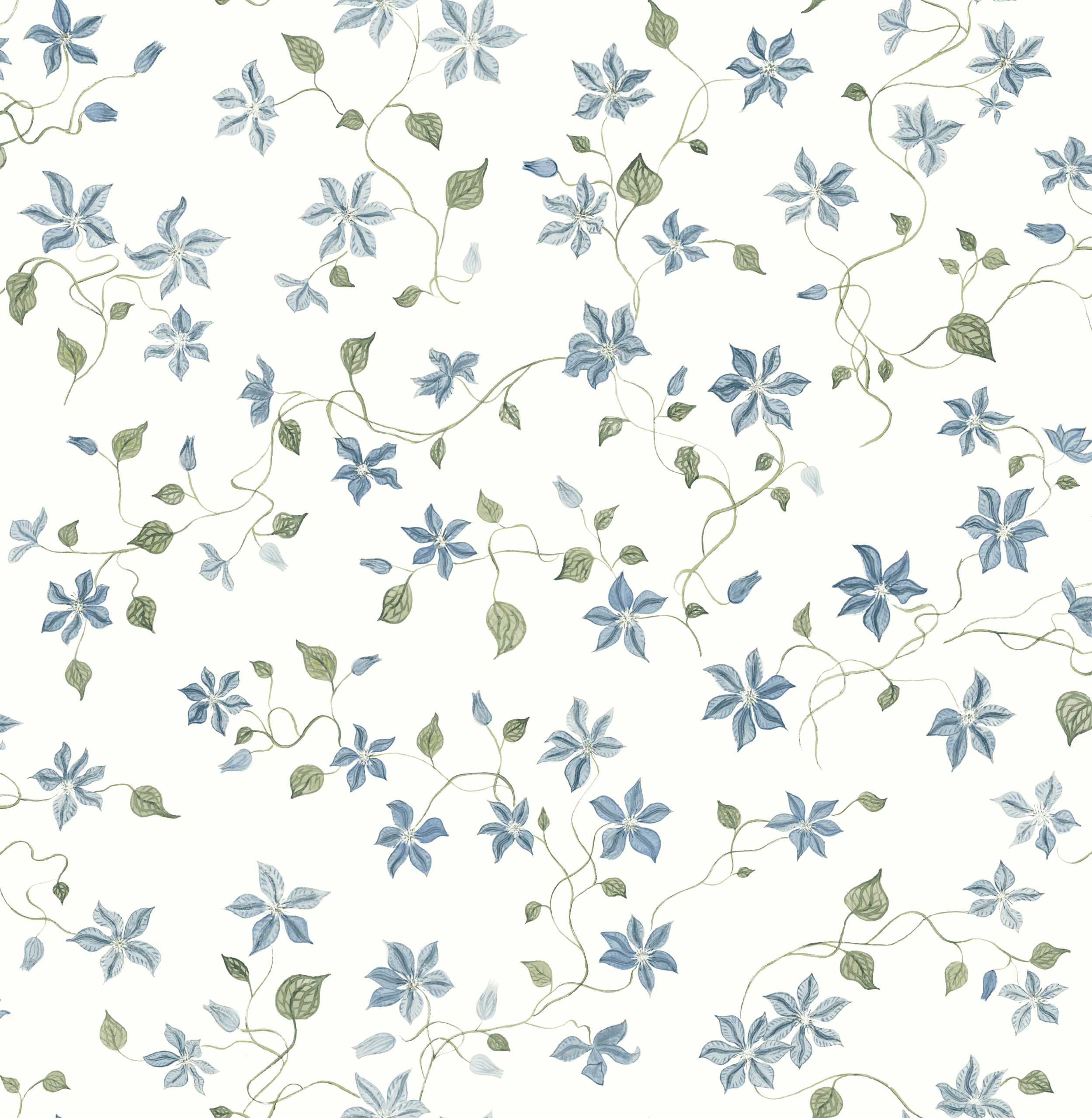
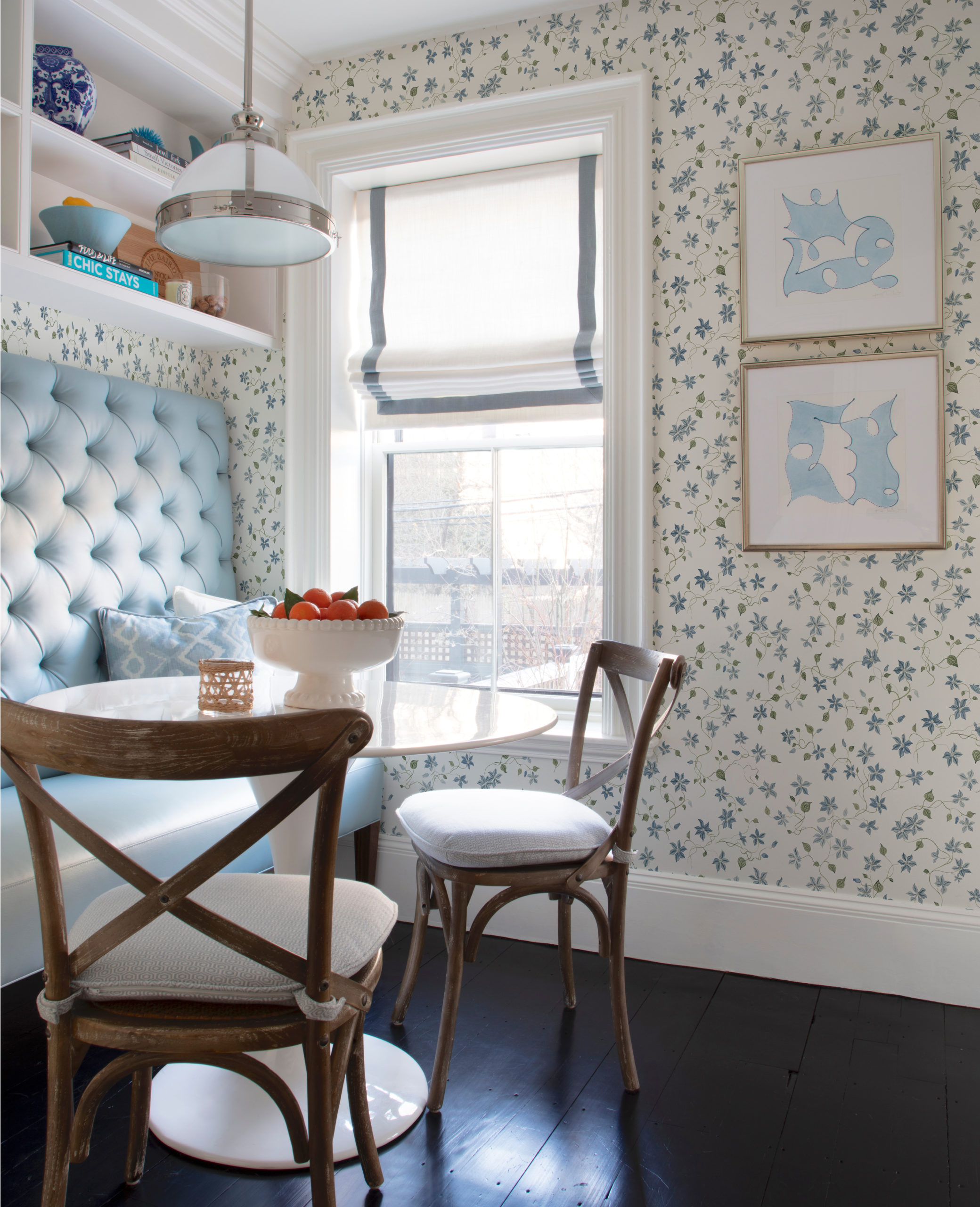
BETSY
This pattern is an homage to my mother, who is an amazing gardener and has the most insane clematis at her home. We changed the color way to blue and green to appease the masses (purple being a bit narrow in appeal). But the painterly, organic shapes and pattern are just so pretty.
 I hope you all love it and I cannot WAIT to see how you use it in your own homes!


I don’t suppose someone will partner with you/the wallpaper company on making some of these into fabric patterns? The Wellesley and Betsy patterns would lend themselves to this in particular. I would LOVE to slipcover a sofa or make a duvet cover in either one of them. Think about it!
I love the collection and the names and the stories behind them! Congratulation!
With so many ugly wallpapers in the world, what a pleasure it is to see these. I love, love the stories behind the names of each one, and that you somehow keep a New England aesthetic without it looking like things from Ye Olden Tymes. Just lovely. Congratulations!
Congrats on the launch! These are all so beautiful and I just ordered a number of samples. May I ask if you think the Wellesley would work in a small powder room or if it’s really better suited to a more formal space? Thank you!
very thrilled for you! Keep up the great work. I look forward to your posts.
Beautiful!
Chic but traditional just like our beloved New England, esp Connecticut ❤️
these are really beautiful – the variation in the bows, the bird print, the clematis – makes them so special and unique-looking.
Right on the money!!! I want that “Henry” on my dressing room ceiling!! franki
Congrats! These are tasteful and classic- exactly what I’ve come to appreciate about your aesthetic. Best of luck
Beautiful! And congratulations on your wallpaper! I loved the back stories. :)
Really lovely prints. I especially loved reading about the inspiration behind each pattern. Well done!
All so beautiful!! Hard to pick a favorite!! Congratulations!
So so so beautiful, I can’t pick a favourite!! Congratulations, Erin!!!!!
Absolutely LOVE everyone of these!! Congratulations – love following your career – you really inspire me – as a business woman and fellow designer. Thank you!
Beautiful! So well done. Congratulations!
Stunning. Gorgeous. Perfect. I feel sort of sick because I just ordered new wallpaper for our dining room and I honestly prefer a couple of these. BUT we do have a couple other projects coming up and I am 100% using at least 3 of these.
They are all perfection!!! The Wellesley!! Must find a place to use it in my home!!
These are beyond gorgeous!!
Love the timeless classic feel of these and the names – congrats on this amazing wallpaper line! Once again you hit it out of the park!!! Happy Holidays to you, Andrew, Henry, and Emma!
I love all of these! Such great work and what an accomplishment. I especially love that they are all inspired by something in your life and named after significant people in your and your team’s lives.