

Sneak Peek: A Favorite Project From the Book!
You probably saw on my Instagram over the weekend that one of my favorite projects from book 2 graced the cover of the Boston Globe Magazine on Sunday. This was such a thrill for me, as my most meaningful (in new business growth) press I had ever gotten in my career was the cover of The Globe Magazine in 2009. It’s how my most long-term employees (Lindsey and Allison) found me and many, many of my most valued clients. National press is amazing, and makes you feel legitimized as a designer, but nothing beats local press for actual clients in the door. So thank you to the Globe for being such an amazing supporter of me from the get go! Also, in my new book we feature Lindsey’s nursery which is BONKERS good, so it’s kind of a full circle moment in the life of my business!
OK, so this picture is EVVVVVVVVVERYTHING. Michael J. Lee shot this project for the book and this picture was exactly as I had pictured it in my mind when I finished this room (an all time favorite I’ve ever done). I envisioned it as a cover, and so this is very gratifying!
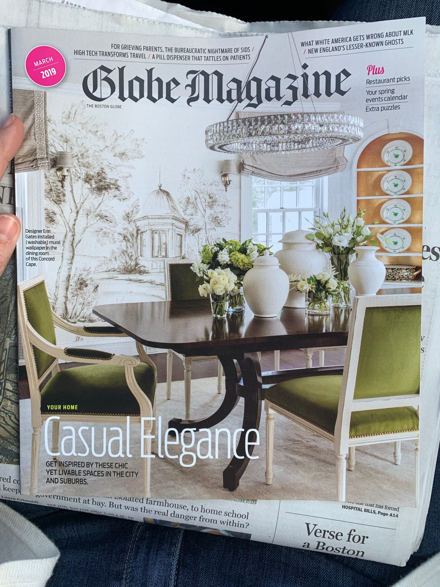
You can read the article by the lovely and generous Marni Katz right HERE.
Since this home is split up into different parts of the new book (WHICH COMES OUT TOMORROW!!!!!), I thought I’d share it here (including a couple images that didn’t make the book, and there are even MORE in the book too). I just love this house, and I think it’s such a good example of great design, but still comfortable and approachable in its style. Some rooms that are a bit more refined while others are totally designed with kids in mind. And it doesn’t hurt that the client is as obsessed with wallpaper as I am.
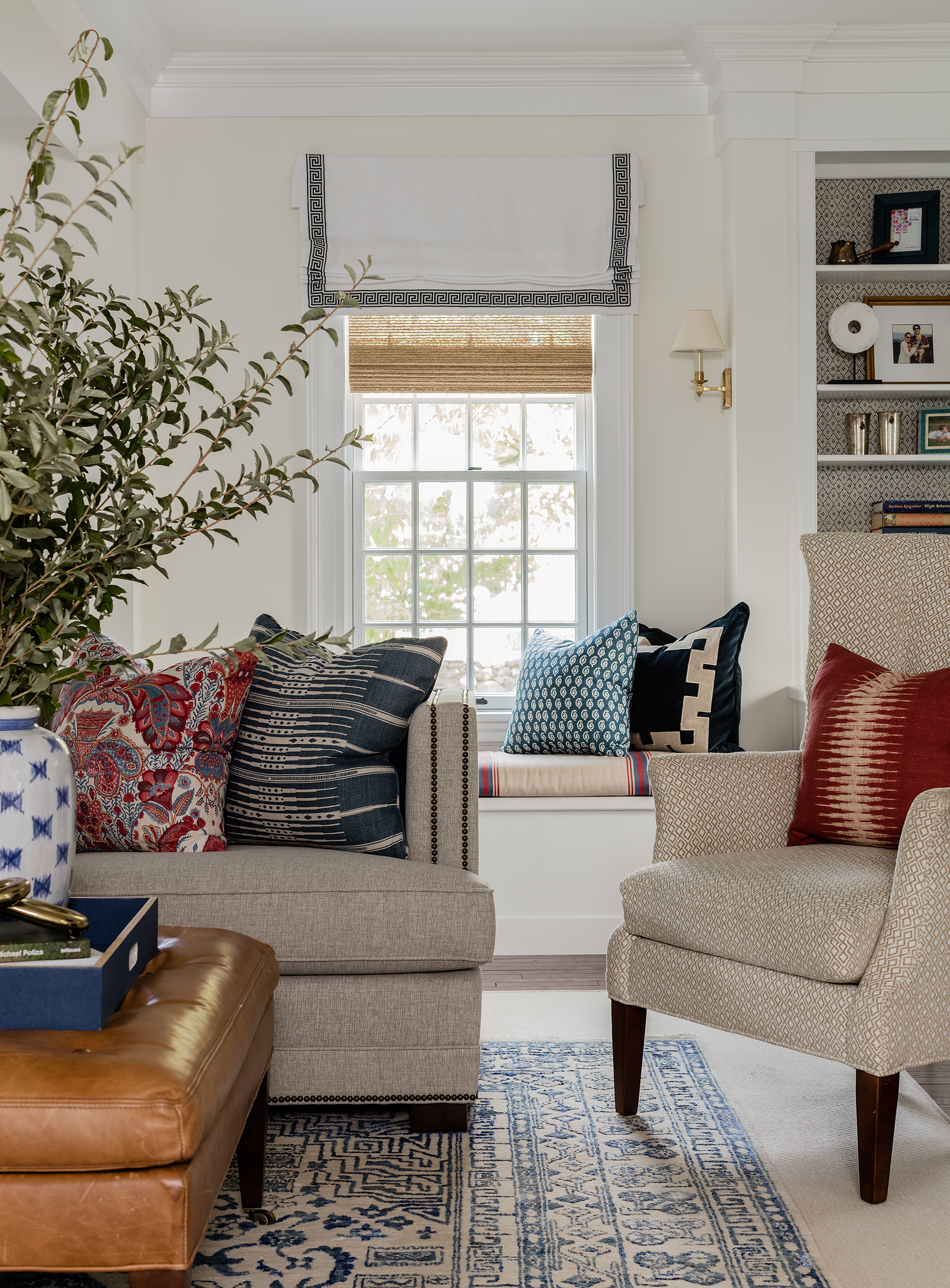
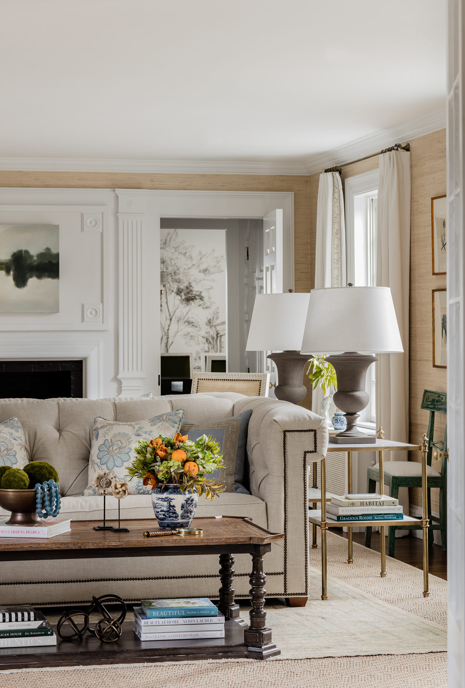
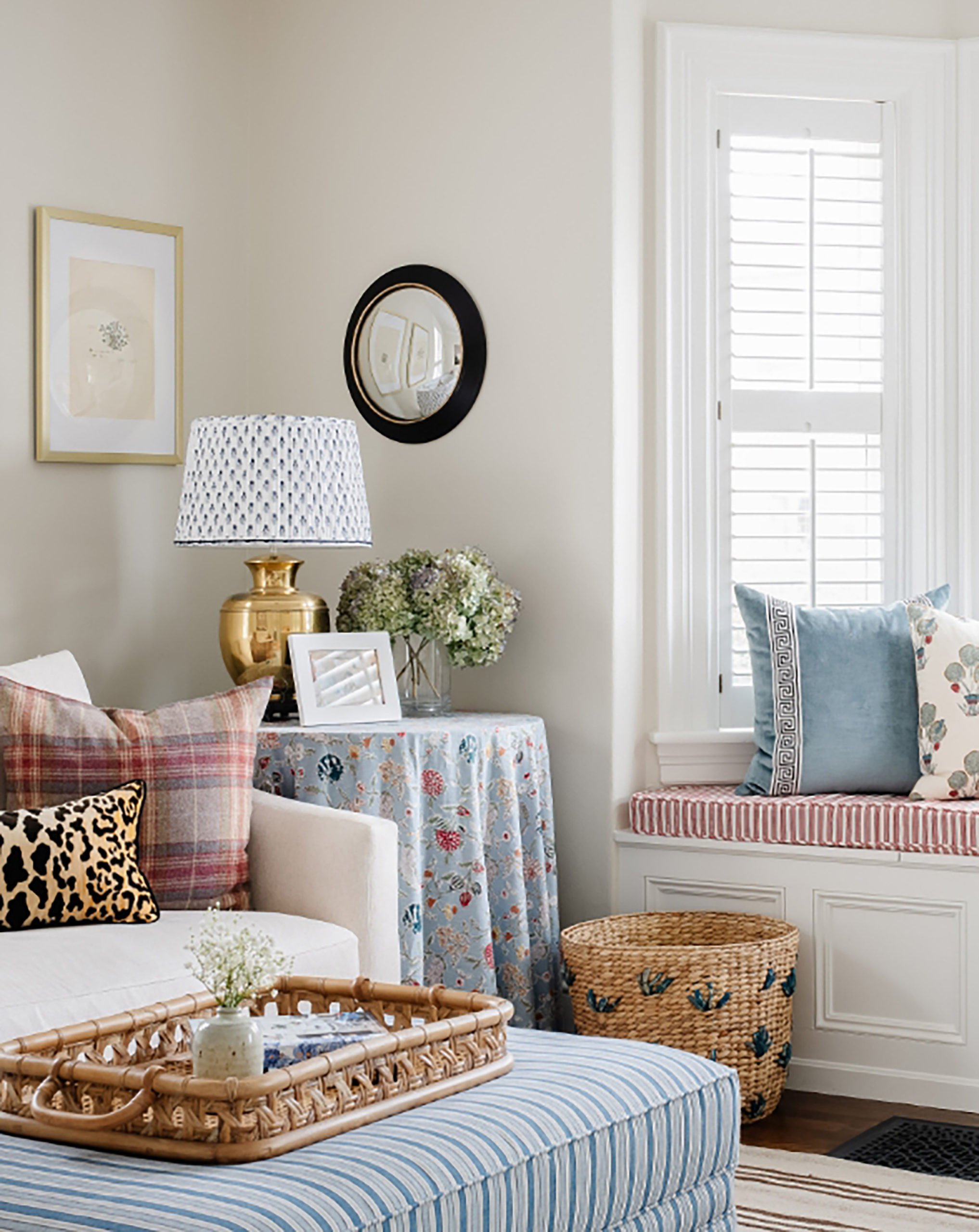
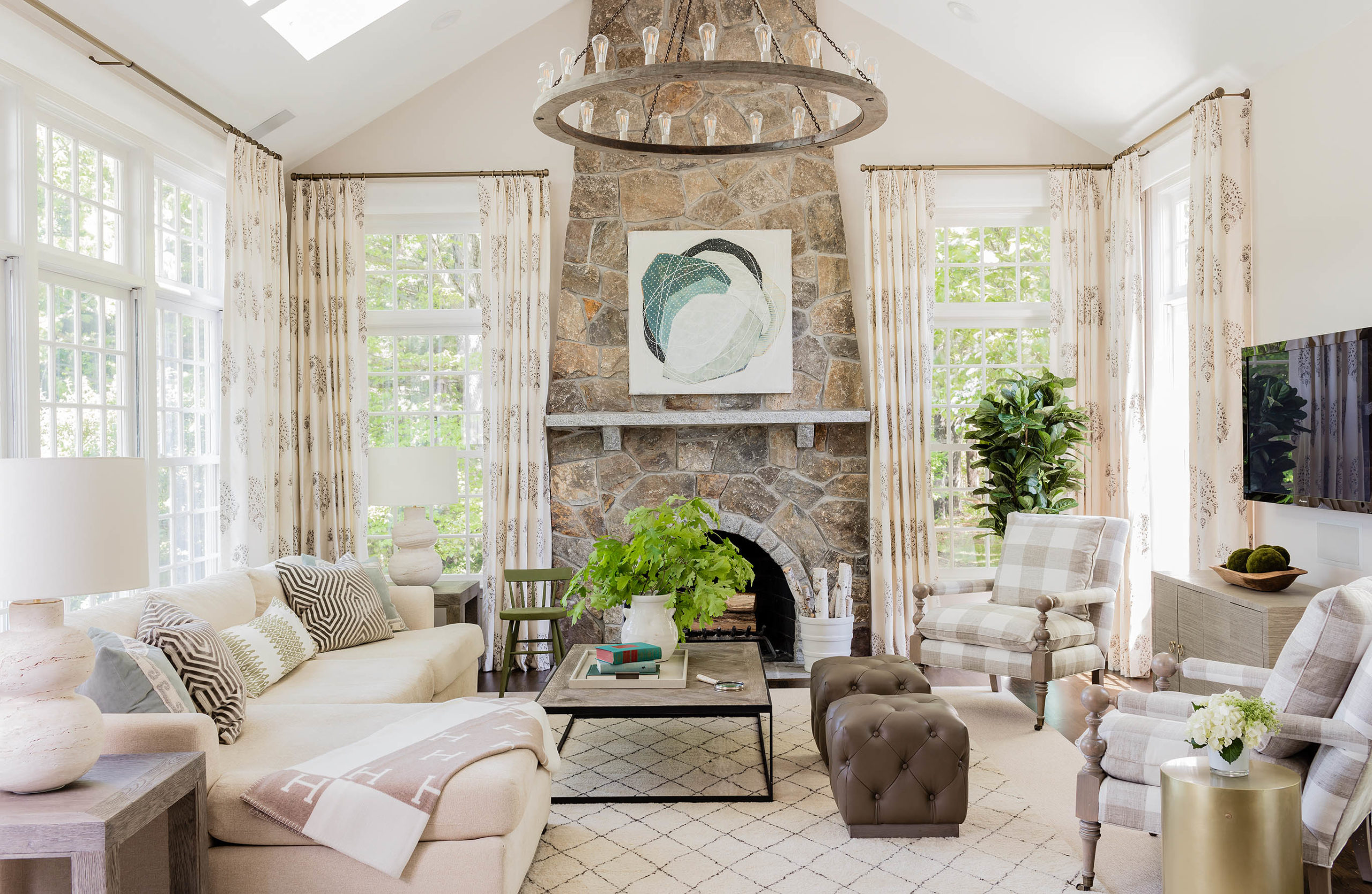
This family room is both totally pretty enough for entertaining but also easy-going enough to be the day-to-day family room. And yes, real people have TV’s in their family rooms – so while not the prettiest thing to photograph, it’s real. This was taken pre-“Frame” TV, so now that is what I always recommend clients install because it’s flat and blends right in with the decor (but not everyone wants to toss a perfectly good TV, either)!

As stated in the article, I rarely use red, so this request for red in this room by the husband made me stretch my design muscles a bit– but OMG do I love it!
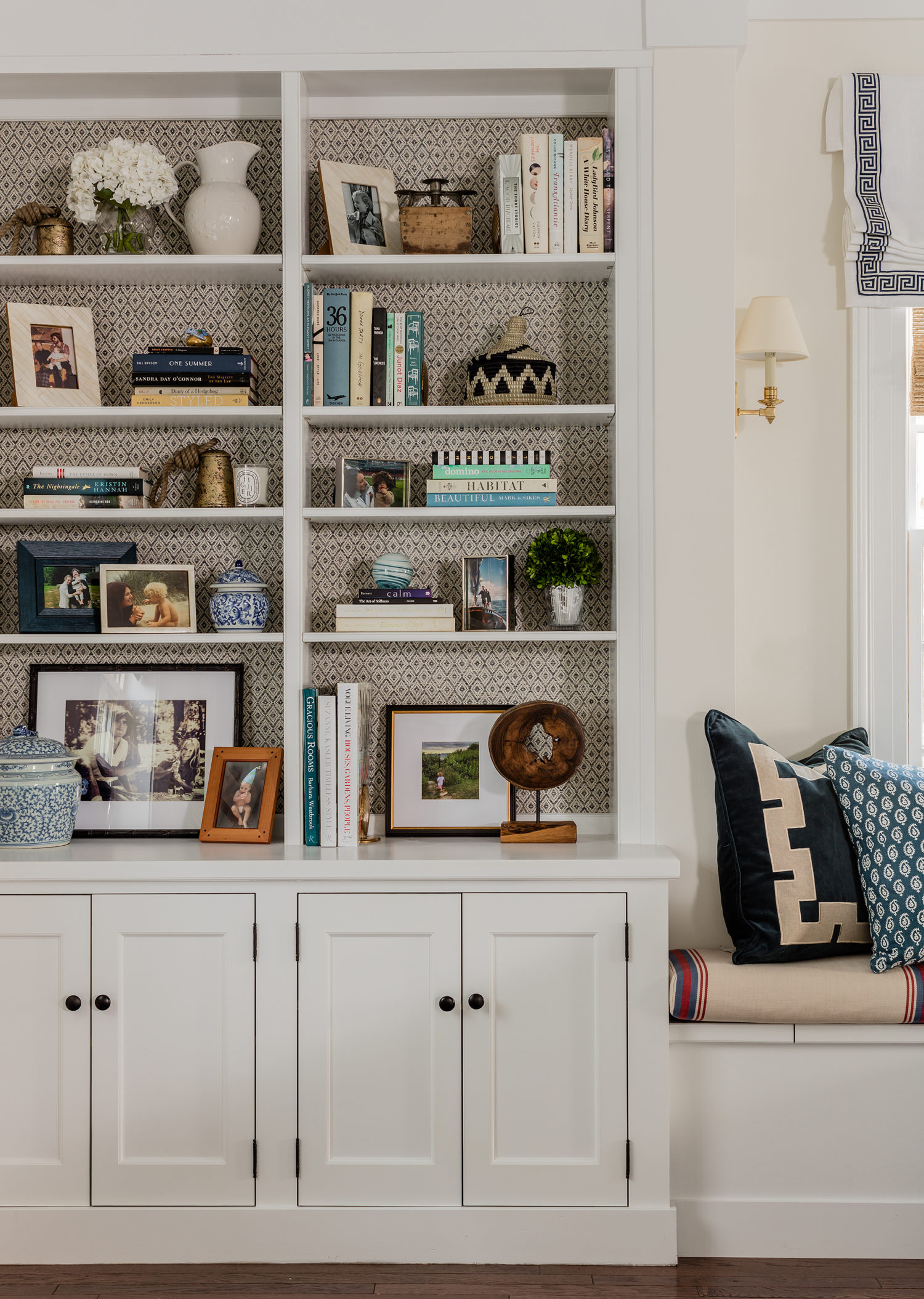
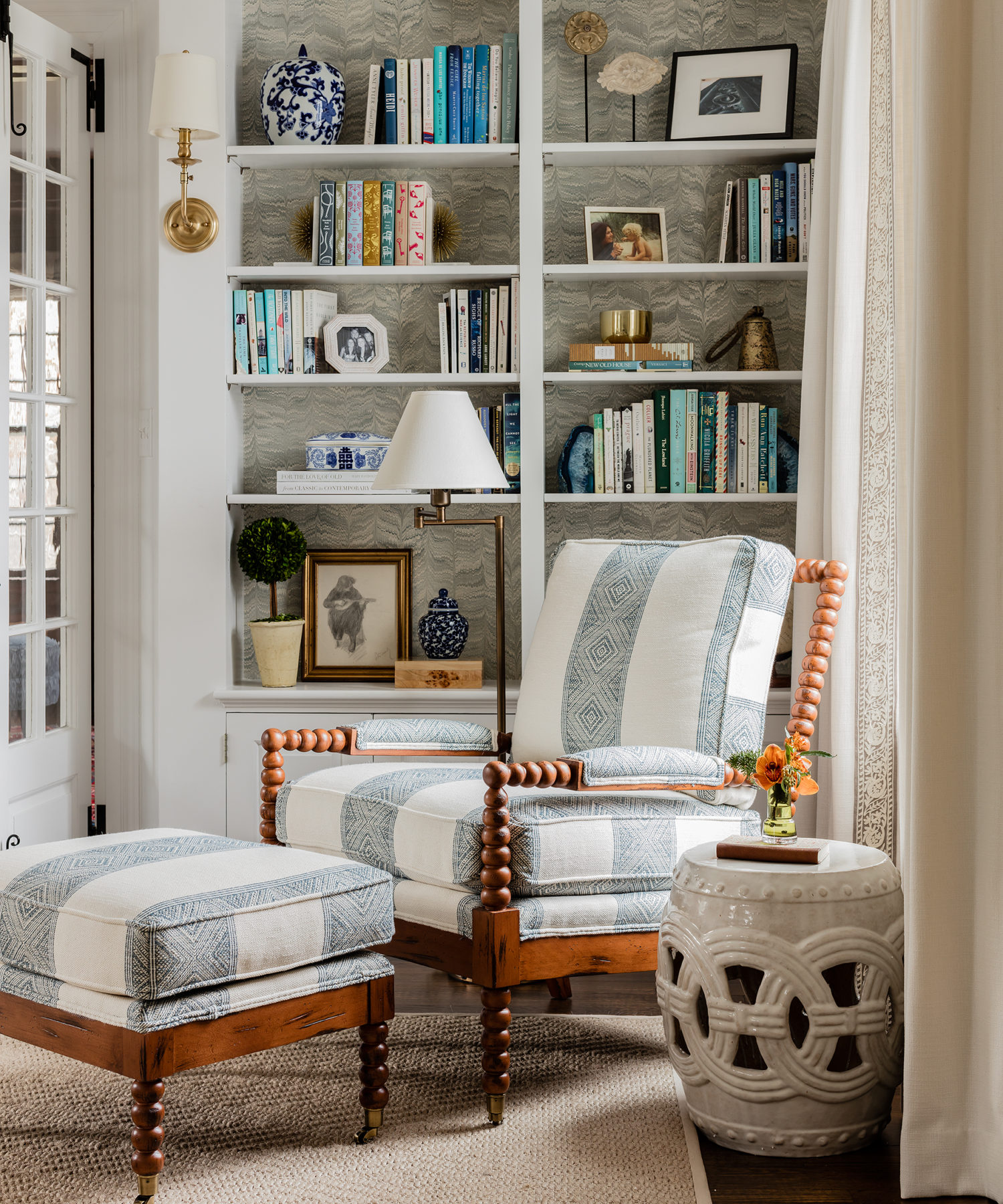
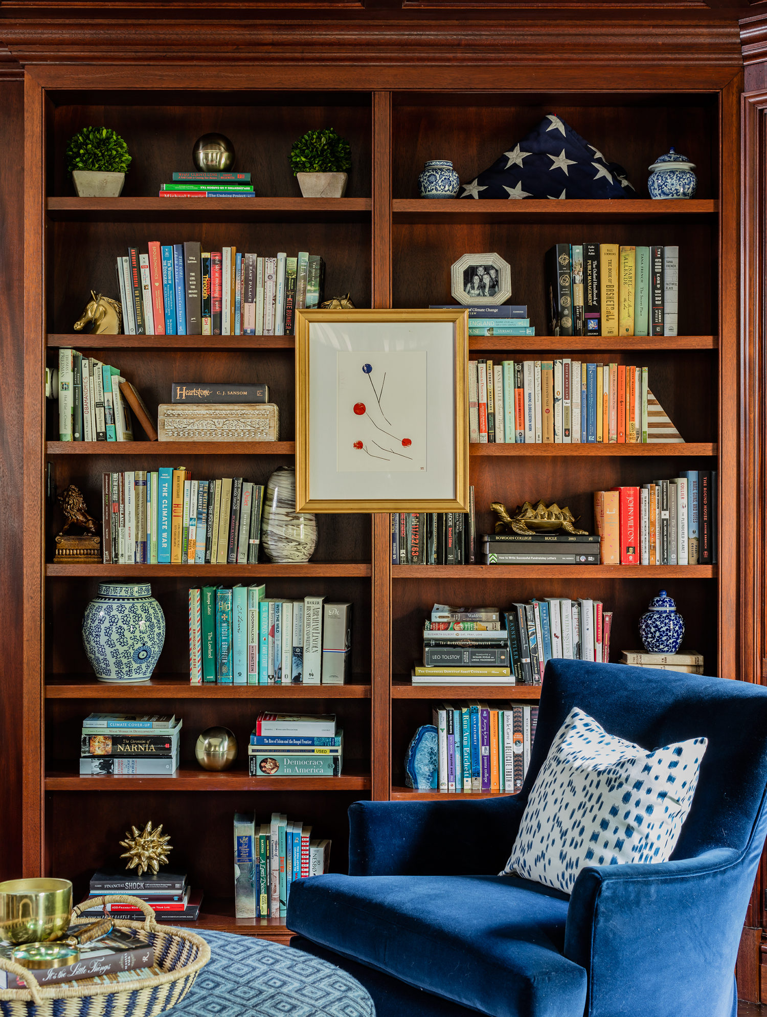
I always like to add some grasscloth or wallpaper to the backs of bookshelves- it makes everything pop on the shelves and adds warmth– sometimes huge built ins can feel a little cold.
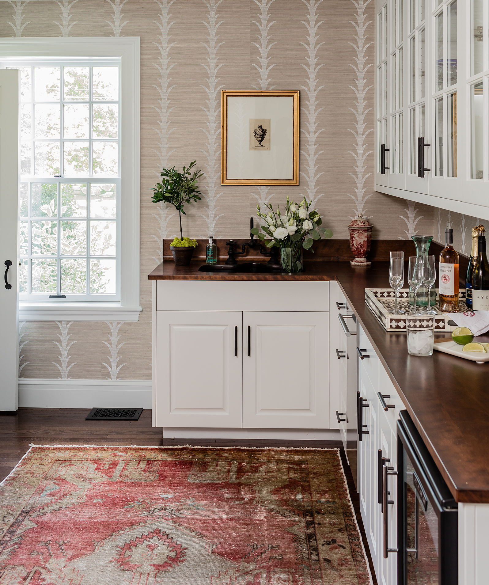
This is the pass through butler’s pantry, another opportunity for wallpaper!!! :)
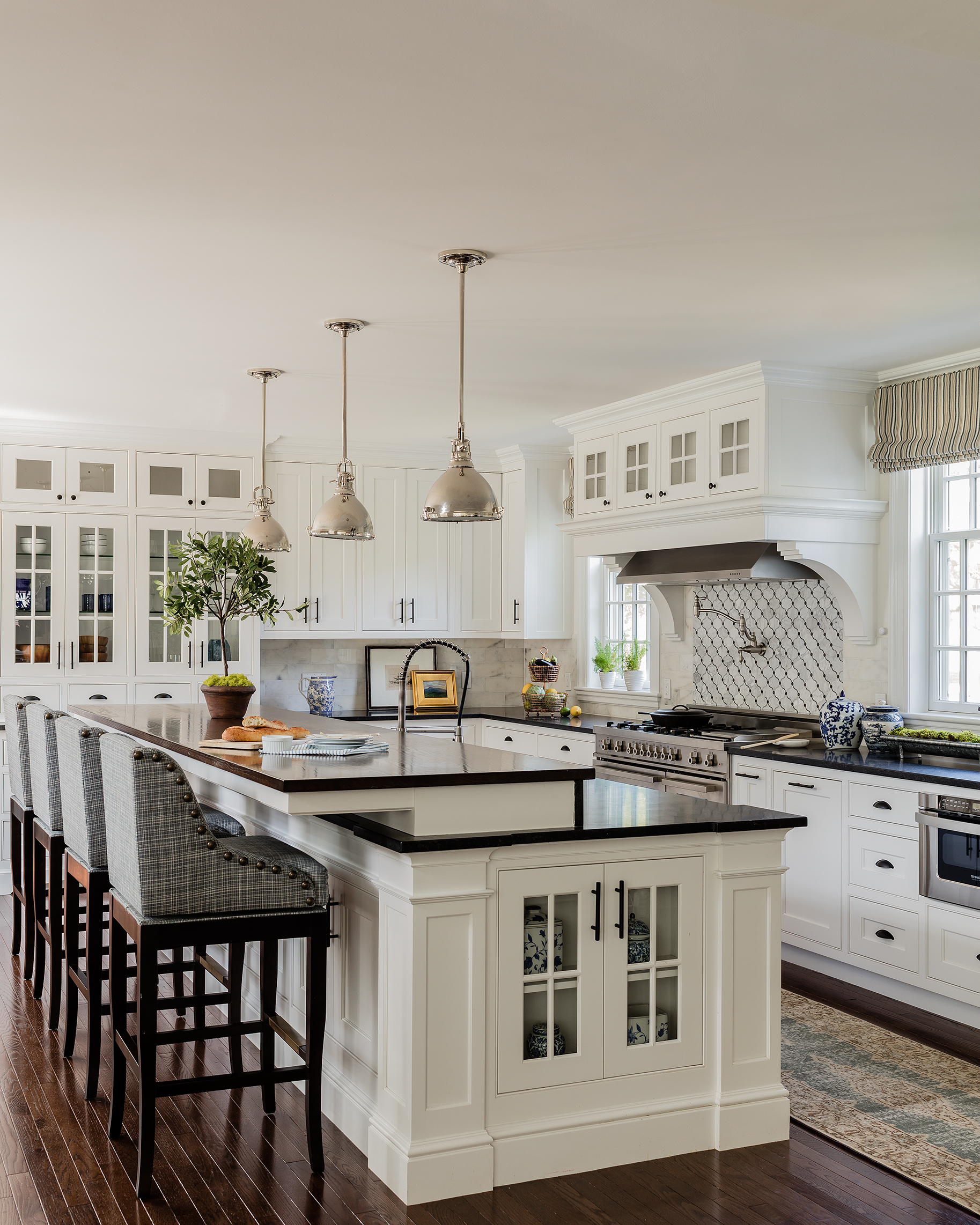
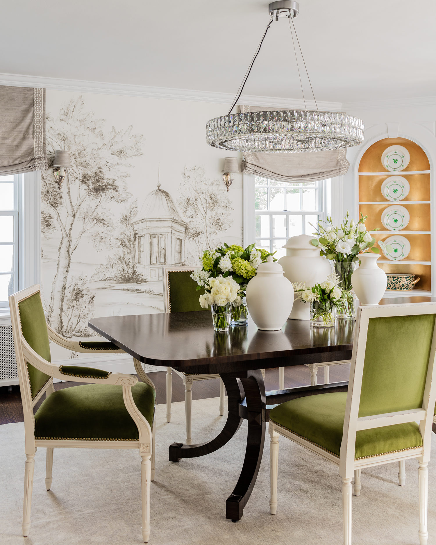
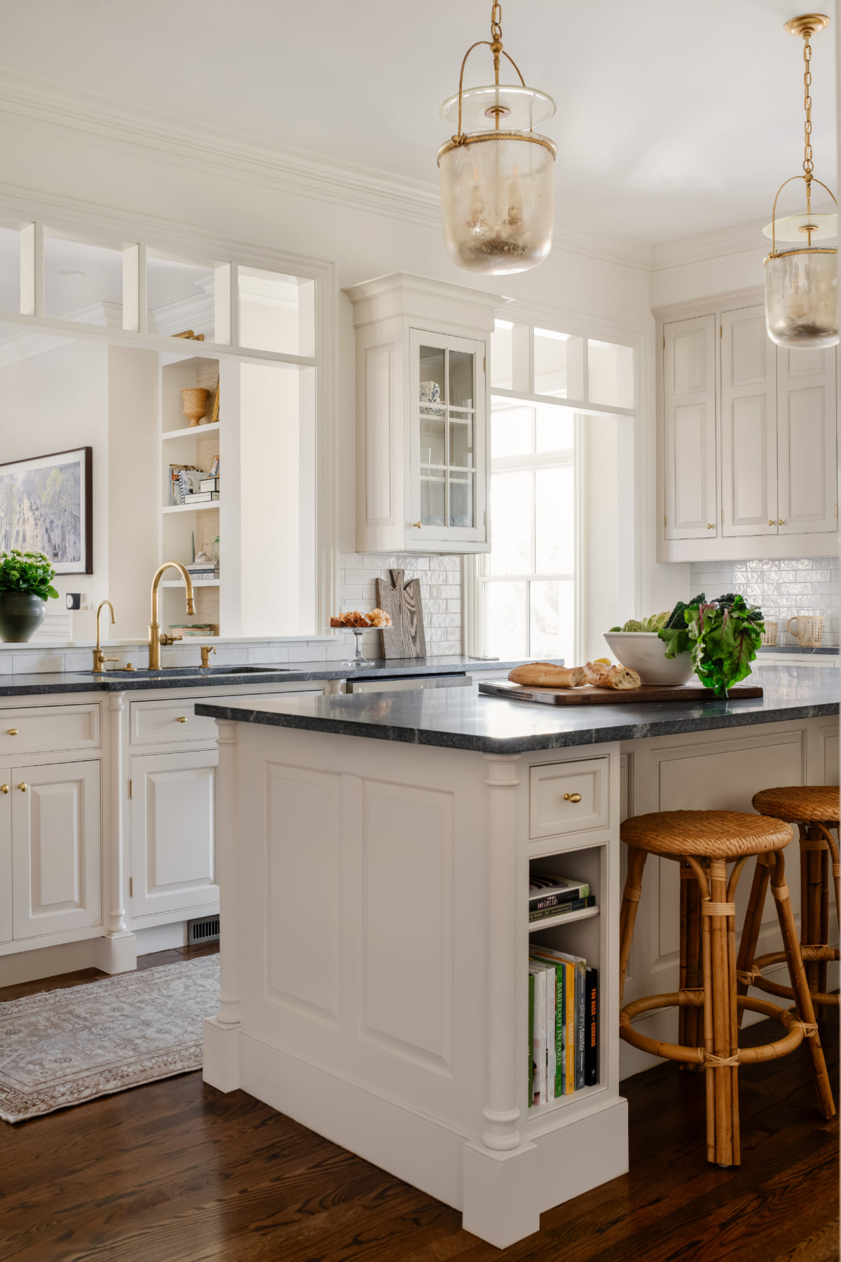
This house was newly renovated when we started working there, but we did change the pendant lights in the kitchen and did some barstools and a rug.
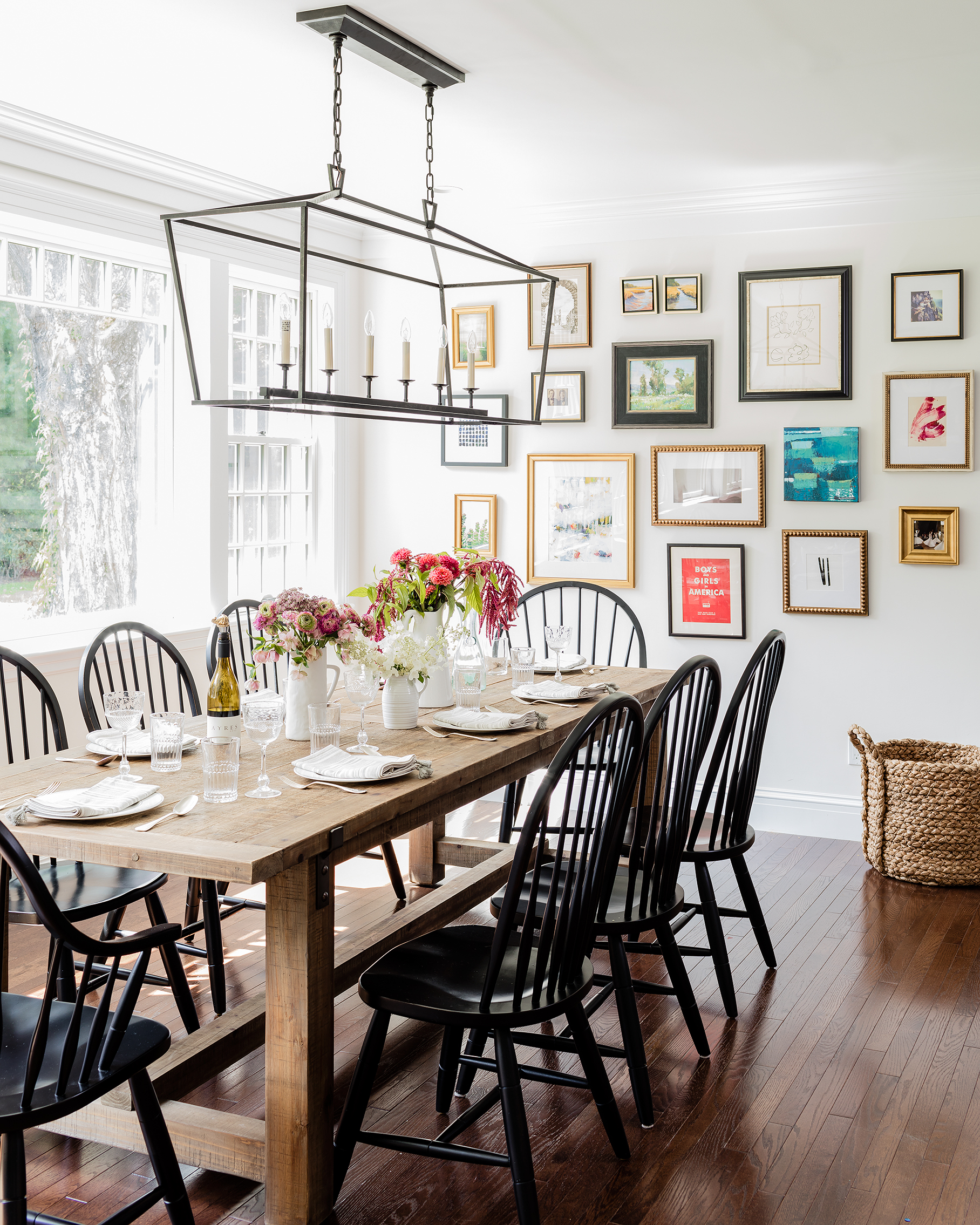
The clients already had this dining set and there was NOTHING wrong with it, so we just added a cool light fixture and gallery wall.
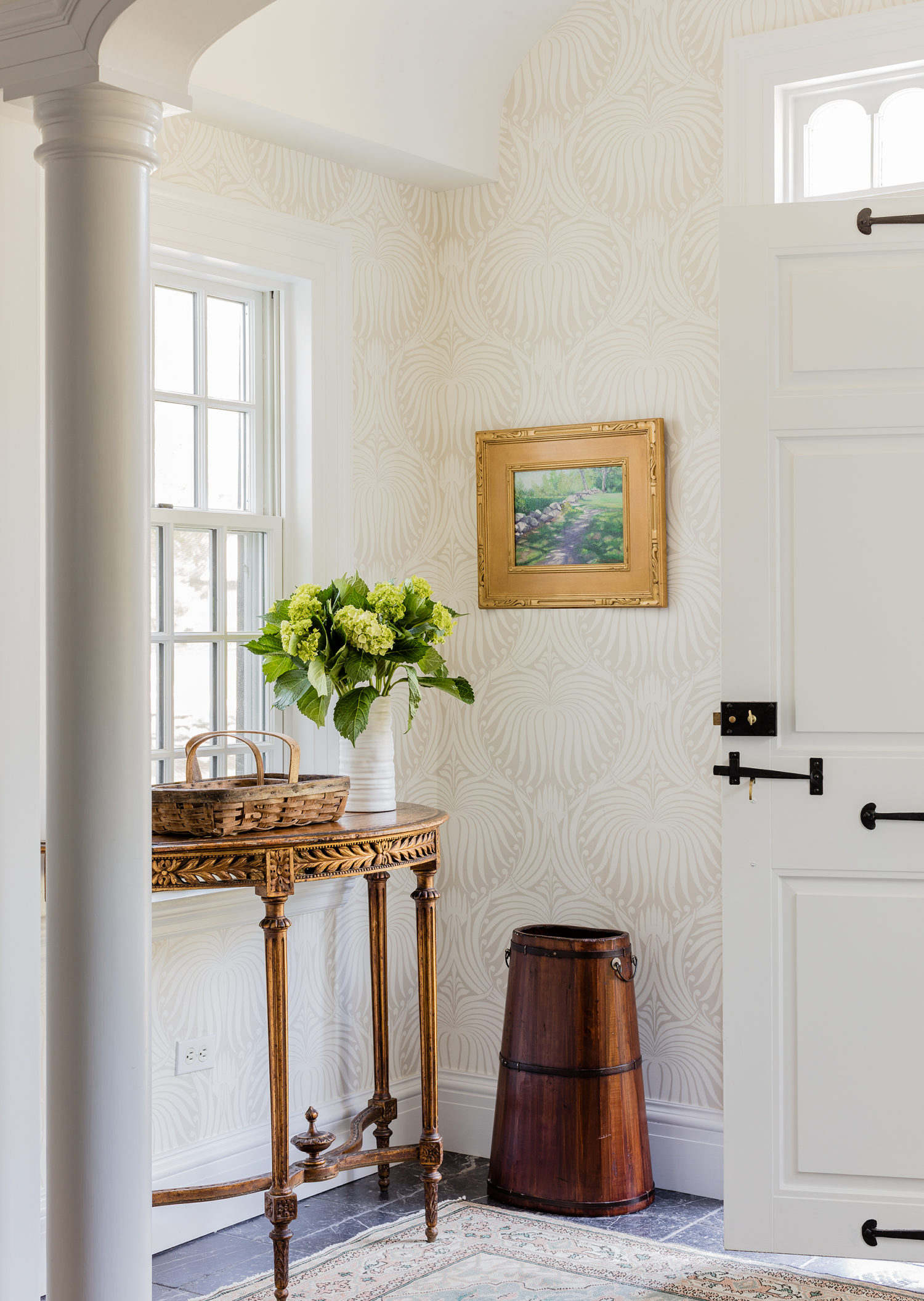
This entry needed a little oomph, so we added a tone on tone Farrow & Ball wallpaper to the walls and this DROP DEAD antique console I found on an antiquing trip. I’m obsessed with it. And how cool is that original door?
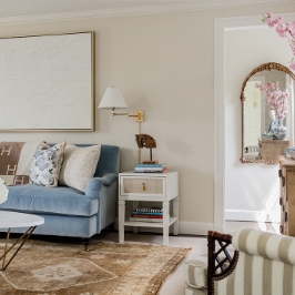
The formal living room is certainly more refined and formal feeling, with being FORMAL. Long, skinny rooms can pose a layout struggle, so we decided to do back to back sofas to create two seating areas. We warmed it up with a natural grasscloth on the walls, layered rugs and a color scheme of paler blues and linens.

This wallpaper is SO perfect for the back of bookshelves as it reminds me of antique Florentine endpapers. And this chair? Oh my. A true favorite.
Looking into the dining room from the formal living room.
Really can’t get enough of this shot. A custom dining table paired with Ballard chairs (in COM velvet) is a great mix, but this paper in the scene stealer.
I wanted to offset the traditional paper with very modern art, so we bought this piece by Mallory Page to add an unexpected twist.
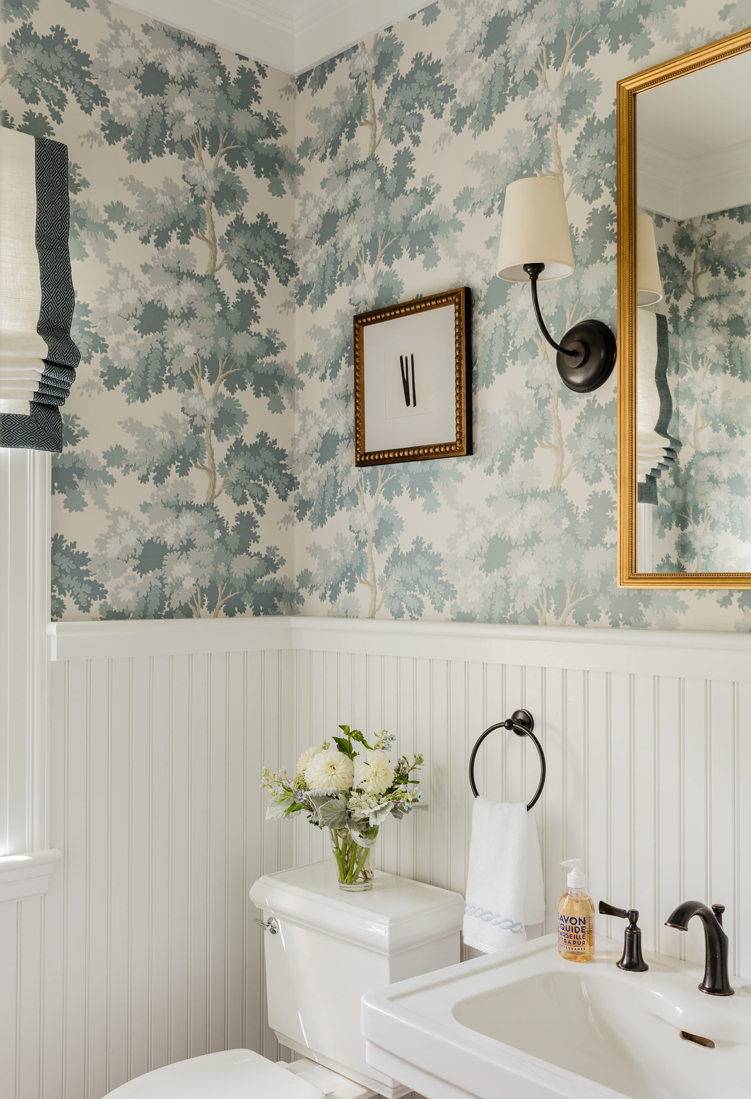
One of the powder rooms all dressed up and looking mighty pretty.
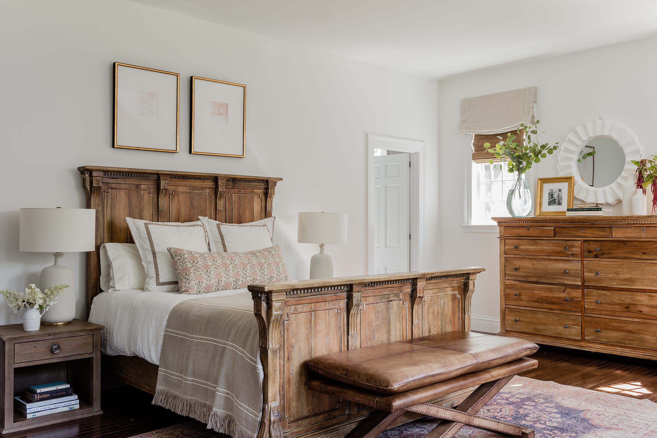
The guest room is a nice, clean space with a slightly more rustic feel. They bought a bedroom set before working with us, but we made it work!
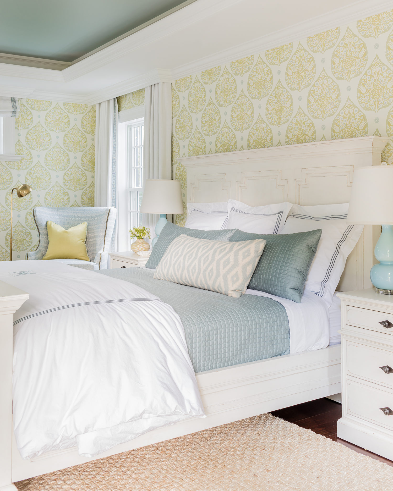
A calm and soothing master bedroom (and notice the wallpaper in the little entry hall!)

The guest suite was a room we had some fun in! This Galbraith and Paul wallpaper is so awesome in this colorway of chartreuse and pale turquoise!
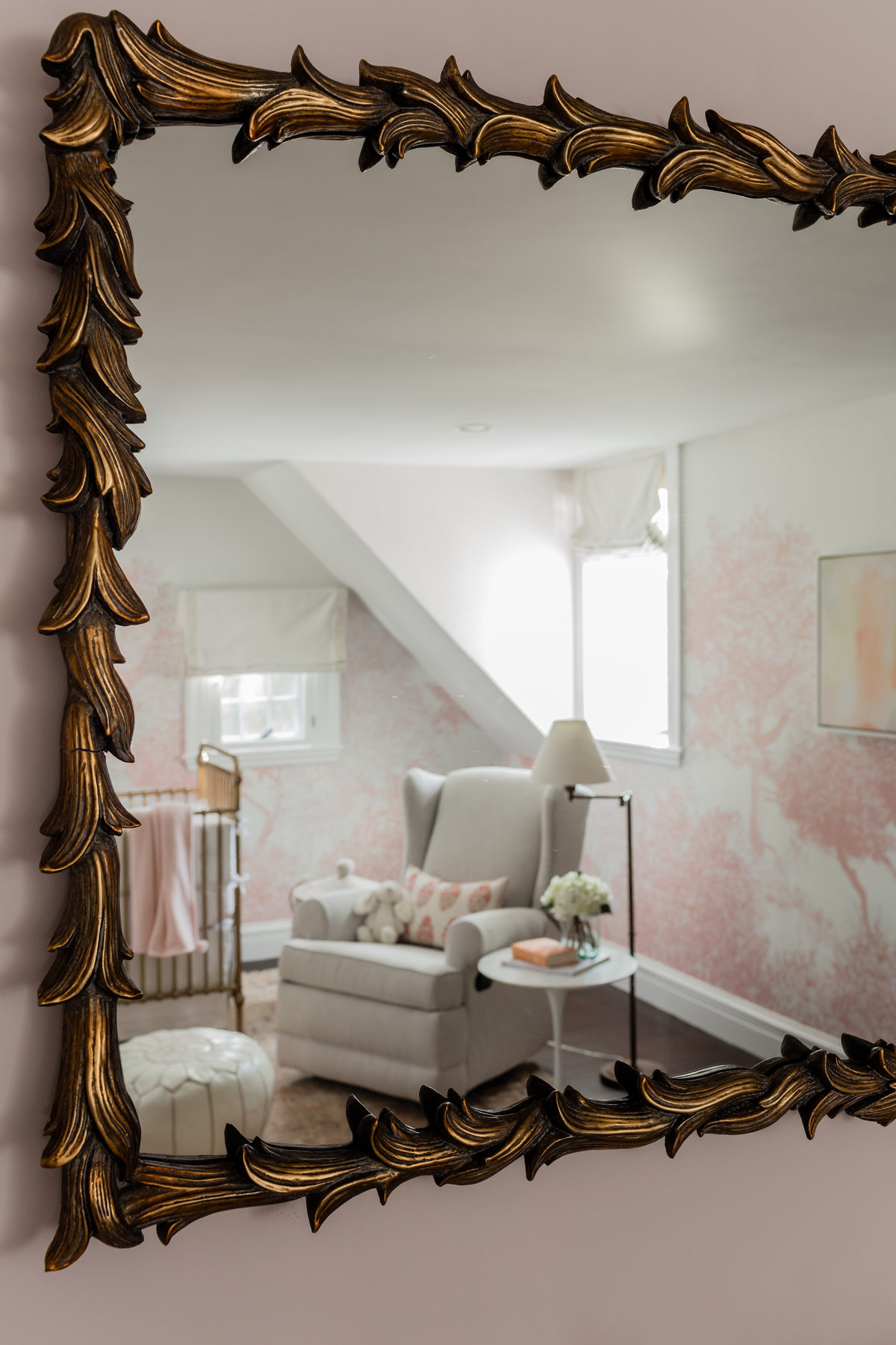
And yet another great wallpapered room- the baby nursery! I adore this space- the brass crib feels so vintage and the scenic wallpaper paired with the vintage rug (an Etsy find, believe it or not!) is the perfect complement.

The son’s room is SUPER fun, you can see the whole space in the book…. it’s pretty amazing.

The library is an updated take on a classic, dark wood library- chairs in contract velvet so the kids are welcome to come in :)
While this project is a lot of custom items, you can still get the look sourcing through retail shops!
SHOP THE LOOK:

See you tomorrow on pub day! Hope to meet some of you at our launch event and also hear what you think of the book!
ExploreEnjoy More
Browse:

Wow I just love this post because I am excited for you and just love this house! Also just bought your new book, can’t wait to get it tomorrow.
Absolutely stunning. You have eclipsed yourself!
Erin, I have been so busy I haven’t had time to read the book all the way through. I’m trying to start from the beginning instead of jumping ahead too much, I don’t want to miss a single word or photo. But from the pictures I have seen it’s truly stunning! I have it displayed on the top of your other book on a garden stool and it looks beyond great!
Linda in San Diego
Love the wallpaper on the back of the bookshelves in the living room. Can you tell me what it is? Thank you!
Just beautiful – love all the wallpaper, spindle chairs and now I need to find wallpaper for my built ins😉.
Nice to see placement of Thomas OBrien wall sconces as I have the same and was wondering if I hung them accurately and now with this pic I’m confident they are Erin approved height!!
Also bought your book today!!
Staring at my mailbox, anxiously awaiting your book!! It’s been a long wait but, no doubt will be worth it! A longtime fan and blog follower, I absolutely love your design style and practicality, as well as your writing. Congrats, Erin! It will surely be a HUGE success!
Magnificent House Erin!!! Congratulations!! Can you share the source for the Florentine wallpaper?
This is stunning! Thank you for all the info, and congratulations on the book! Can you give any more info abou the bedcovers and linens?
Can you please share the favorite jute rug you mention? Thanks! Love your work. Look forward to meeting you at OKL on Thursday!
These rooms are absolutely stunning. Can’t wait to read the book.
Love this dining room! Where did you find the chandelier? Is it restoration? It’s exactly what I’ve been looking for.
What a gorgeous home! Beautiful work – obsessing over that Acanthus wallpaper in the butler’s walkthrough – looking at that in blue for a project….
Those green velvet dining chairs! Swoooooooon!
Love! I’m especially loving the blue contract velvet chair in the dark wood library. Where is it from? I’ve been looking for one like it and this one looks perfect!
Bananas good. Elegant yet accessible. Well done!
Very beautiful. Funny, I am also using the Raphael wallpaper in my bathroom, but the all blue color, and I used a different Sian Zeng wallpaper in my girls’ room. Great choices!
Beautiful throughout and gorgeous wallpaper!
Love the library ottoman fabric; can you share the source? Congrats on a great project!
Love! I will now be waiting at my door impatiently for my copy of the book to arrive!!
This entire project is simply stunning! The color palette is classy and not in not in your face, but it makes the house warm and welcoming. My favorite of all has to be that spectacular dining room!
Congratulations on a beautiful job!
So beautiful. I really love the unexpected pops of red! Good luck with the book launch – can’t wait to get mine!
This project is fantastic! I have the terraced side tables from West Elm and love the look of them but mine are not very stable. Just curious if you’ve had that issue with these tables?
My pre-ordered book is on its way! Can you advise about the lack of window coverings for certain areas, like the kitchen dining area? Is that the client’s choice to stay uncovered or was that just for photographs?
Also, if a wallpaper does not have a brand/source listed, does that mean it is a custom paper, like the dining room? It is GORGEOUS.
The client wanted to keep those windows bare- lets a lot of light into the room, which is a little dark on the other side…also, no privacy issues.
OMG! I love this house! You are so talented! I just ordered your book. A quick question…what is the name of the wallpaper in book shelves. I love this!
Now I’m really looking forward to my book arriving… next week I think. So many good things in that house. Love the bookshelf styling. I had to pin that chair … so fabulous.
Last book you did a fashion post on what you were packing for the book tour. Hoping for another one. Or a post with your very fashionable staff sharing what they were drooling for and buying for spring. One of those would be great.
I’ll be posting book tour outfits, yes! And I will do an office want list post soon too, great idea!
I’m having such difficulty arranging my bookshelves, and you seem to have an incredible knack for it. I’d love for you to have a blog post as to how you go about organizing them so perfectly!
Great and lovely pics…I am looking for advice on grey tile options for a side entry which opens up on a family room.
Great project…congratulations on the wonderful press. Could you please tell me the source of the delicious powder room wallpaper? Thanks.
Hi Mary-
I’m obsessed with wallpaper and I just happen to know the name of it: Sandberg Raphael. I think it’s available on etsy or decorator’s best. Happy papering!