
Fashion Friday: Pretty in Pastel (& How to Wear It)
Pastels are HOT HOT HOT right now and while they are the perfect palette for spring, they can be intimidating to wear. Without the right style or mixing pastels can go VERY “I’m off to go see the Easter bunny”. Which is cute when you are 4, not so much when you’re 40. Darker complexions look radiant in these tones, but paler folks need to make sure they pick the right shades to compliment their coloring and avoid looking washed out.
That said, done right, pastels are uplifting and crisp and a totally beautiful palette to wear.
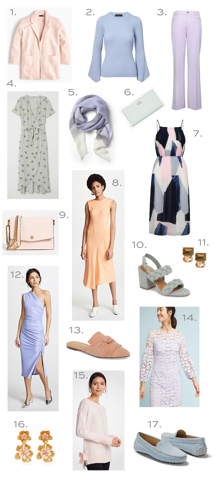
1. ( I have this in the winter version in two colors and bought the new powder blue version– blush is next on my list! Best cardi and 30% off now!)// 2. // 3. // 4. // 5. // 6. // 7. (the black and navy make this more edgy than sweet) // 8. (the back of this dress is amazing) // 9. // 10. (looooooove) // 11. // 12. (perfect for a summer wedding and on sale!) // 13. // 14. // 15. (I love a good bow detail!) // 16. // 17. (my most favorite loafers!)
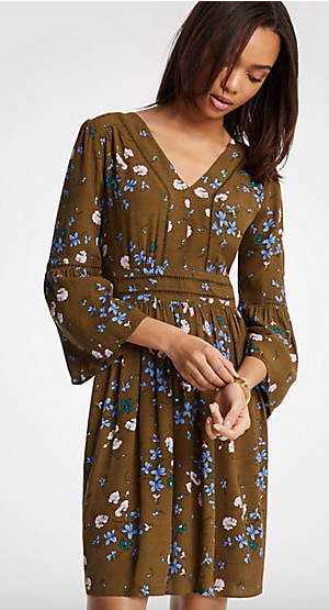
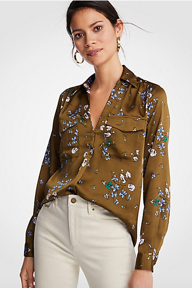
One of my favorite colors to pair with pastels (blue and blush mostly) is olive green. Ann Taylor has a few pieces in this floral print and I ADORE the color combo (plus everything is 40% off right now!)
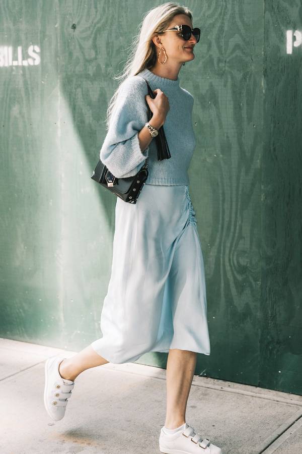
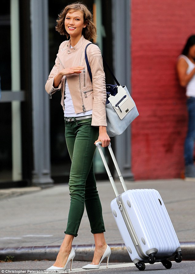
Karlie shows us how it’s done (did I tell you guys I saw her in my hotel in NYC a couple weeks ago. Nothing like breezing past Karlie Kloss after a long day of meetings to make you feel like a troll! #winetime)
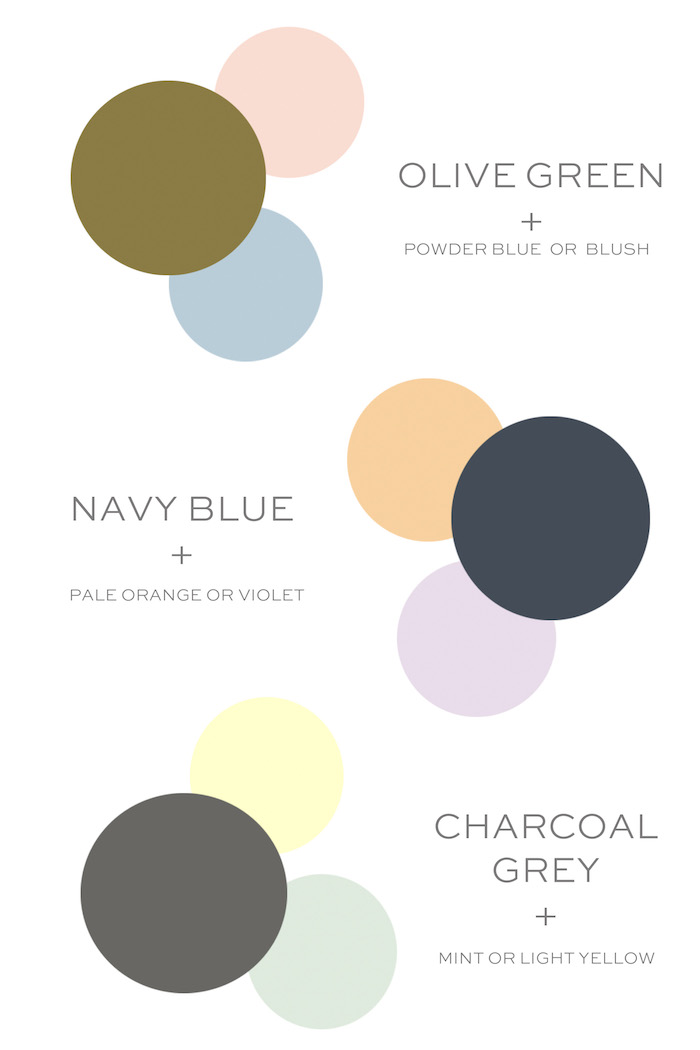
Here’s my little cheat sheet to wearing pastels with darker colors to tone it down from being saccharine to grown up.

ExploreEnjoy More
Browse:

I like these posts! You are very good at the stylist. I always look forward to your article and agree with most of the content.
Hi! Erin,
I hope you get to see my late comment becase I wanted to give you a big Thank you for the color cheat sheet. I’ve been wanting to implement pastels (and heck, color!) into my wardrobe but going from black to pink its been daunting. I just want to be more feminine, I discovered I’ve been hiding behind black for yearssss. I (I love blackm of course, but for me its been all about just hiding my feminilty. Scared of accentuating my already delicate ultra feminine demeanor under a black palette. I want to look more like myself, allow myself to express it…. which is more pastel-ish and small flower -ish, feminine, little pearls and imperceptible golden chains with a bit of spark… But OMG no, NOT the Easter bunny or a care bear. So Thank you for the color palettes, please continue doing that, it’s so so so helpful.
With appreciation,
L.
I love this, I have been eyeing up pastels for Spring, and this is so helpful!! Can you share what size you wear in the Jcrew blazer/jacket? The reviews for sizing are kind of all over the place, so it would help to get some perspective from a real person. Thanks in advance!
Great question! I bought the black one in my normal size and I am trying to style it and it just makes me feel dowdy. I ended up tying a black leather belt/strap around my waist to help feel more pulled together. Erin – I know you’re a big a fan, help us out on how to wear it!
Just wore the palest of pink jackets today and honestly got so many compliments (good for the soul!) franki
Thank you for the cheat sheet! I pair everything with black or with denim. This helps us style-challenged. Loving the lace dress from Anthropologie too.
Love the concept of pairing pastel with darker colors; sort of sweet and sour or sweet and tangy to cut the sugary effect of pastels. As noted, they are delightful on little kids and also, women of color. Olive and deeper skin tones can make pastels look fabulous.
With my beige skin, I can look like a dead trout in pastels.
Yes! I’m pretty fair too, so pastels are hard to pull off. I’d even say, pick a pastel and pair it with a darker version of the same color (e.g. blush and dark pink/rose, powder blue and navy, etc).
lol, I love the dead trout reference, that’s how I feel too. I once bought a face powder and the color was called “Translucent” – I was like, really? Am, I that pale that you can’t even see me?? :)