
Inspired By: Duck Egg Blue + Red
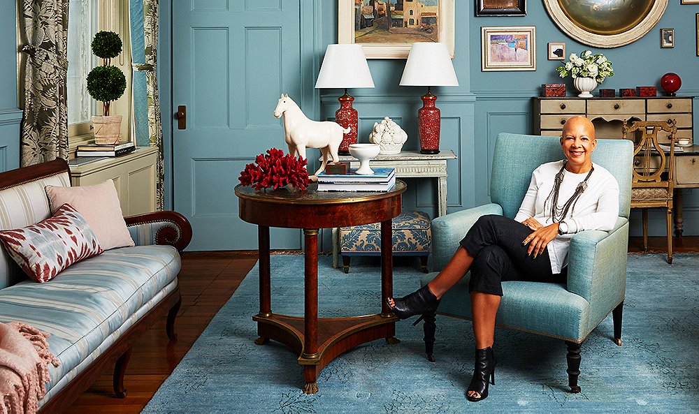
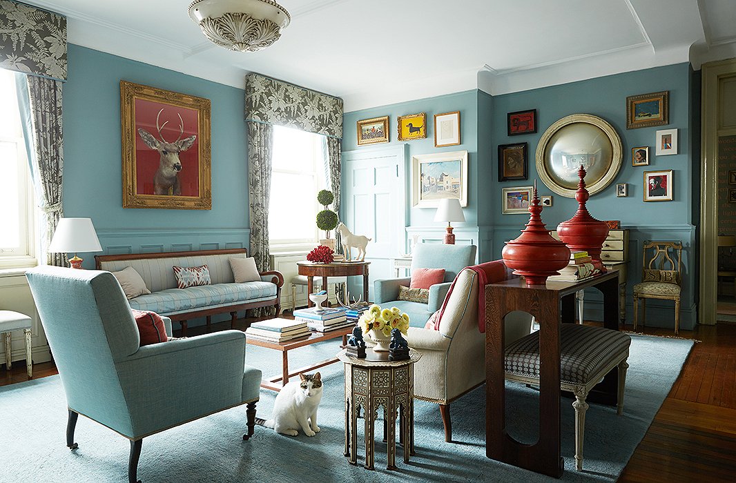
I have long had a complicated relationship with red. Maybe it’s having grown up in the 80’s when “cranberry” was all the rage in home decor and fashion and it sort of scarred me for life. But recently I’ve been coming around a little, especially when red is paired with turquoise-y blues. So when I saw famed designer Sheila Bridges’ home the other day I, surprisingly, fell in love! And as I studied these pictures I recalled my JP condo from 6-7 years ago and that in the guest room I actually TRIED this exact scheme (duck egg blue walls and a red and white toile duvet) and had really liked it. I had totally forgotten about that room. It’s making we want to create a space in this color scheme for a client!
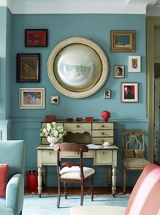
While most of Sheila’s pieces are traditional- the pairing of the blue walls and trim with the pops of bold red read modern. If the trim on the walls was white, I think it would look more traditional and fussy, actually.
It’s funny, when I look at this I think “I would never have made these choices” and yet the end result really works! This is what I appreciate so much about the interior design field- there are so many creative brains to learn from!
I rounded up a grouping of items that can help you steal this look for your own space. Remember to keep the textures interesting (shiny lacquer with matte pieces, nubby wovens paired with silks…)
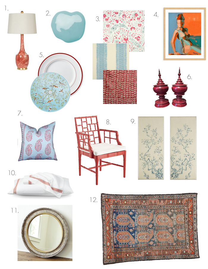
- I adore the marbleized pattern on this lamp, and the gold base and shape are sleek and modern.
- The color on Sheila’s walls in Farrow & Ball Oval Room Blue– rich but bright at the same time.
- Really loving all these fabrics from Soane in England.
- An abstract figurative painting to keep things from getting too stodgy.
- Mix these colors on tabletop too- I paired a red banded dinner plate with this GORGEOUS salad plate reminiscent of Gracie or de Gournay papers.
- A pair of red lacquer Burmese vessels, just like Sheila has!
- I have always loved this colorway of Peter Dunham’s paisley fabric.
- I’d recover the seat of this faux bamboo chair in a tiny blue ticking stripe.
- A pair of chinoiserie panels looks great flanking a bed (on blue walls with red bordered hotel bedding (10), perhaps?)
- Pair this Greek key bedding with its bright orangey-red border with a pillow combining blue and red and some pretty blue walls.
- I love this rustic looking round mirror from Ballard- adding natural wood tones to the red/blue pairing is essential.
- A great antique rug that blends these two tones.
What colors do you struggle with using in your home? What are your favorite color combinations?
ExploreEnjoy More
Browse:

Erin I’ve gone GAGA over Sheila’s home, too! Love that color combo! I wanted to drop a line to say thank you for posting this awesome house tour, but also to tell you about a little sale I’m having on my blog of my interior design and coffee table books. They’ve been hoarded for far too long, and it’s time that someone else enjoy and be inspired by these barely used beauties. As I know you’re keenly interested in interiors, I thought maybe you’d be interested – or could perhaps pass it along to someone you think may be! Hopefully there’s something posted that’ll catch your attention! Here’s the direct link: http://niagaranovice.blogspot.com/2017/02/buy-my-copy.html
Love her work. My family room is full of this color minus the red…was thinking I had too much but feel better after seeing this room!
I like it. The only thing I don’t care for is the deer picture. It kinda freaks me out.
SO PRETTY!!! franki
Love the red and turquoise . Have always loved red, but found a turquoise and red rug in Santa Fe. Now living room has a turquoise wall with red accents
I’ve worked for Sheila for almost 10 years, and have followed your blog almost as long. Fun to see the two collide!
How cool! :) She seems like such a dynamic, interesting person!
Love the blue color!
I adore this room- the shade of blue is what makes it seem so modern to me with all the traditional furnishings. I also really like how she only painted the ceiling and molding up there white and everything else the beautiful blue–even the doors. Love this combination but then again I could easily live in a blue and white home., especially one like this.
Thank you for featuring this color combination! I have recently updated my living and dining room in these colors with gold accents. My walls are painted a lighter SW Analytical Gray. Unlike you, red always finds a way into my decor. I have transitioned from the deeper, darker burgundy reds to the brighter, more cheerful reds. While I love the trend toward neutral rooms, I just can’t do that in my house. I need to be surrounded by color!
Yellow! I am not drawn to it at all, but then I will see combinations with it on Pinterest and wonder if I should give it a try. (Oddly, the only yellow I am drawn to in art, even, is mustard! :))
Umm…Sheila Bridges shoes…want!
I love to read about your observations. You are so right if you look around you can always learn something new every day!! In design we are always on the learning curve!
I went through my red toile phase with our condo in the city. Then we moved into our first home and there was red, yellow and denim all over the place. The red dining room killed me I wanted to barf. We spent a New years (drinking) and pulling off the wallpaper and letting the kids help.
Fast forward, I still can’t do it. I do love blue and white, but can my whole house be blue and white? I love pink, but is it too much? My favorite color is yellow (how do you not feel happy when looking at that color) but its terrible for homes (IMO). I hate brown, yet I have a brown couch. It goes on and on and now Im obsessed with navy. My car, clothes and home. Blue just makes me happy.
Love these rooms! I’m not one to paint a wall red, but I do love me some red punches!
I absolutely love that bamboo chair- recovered would make it even more amazing.
Also!! Do you know where the bedding in your instagram today is from? I’m obsessed!
Xo, Brittany
http://Www.notablob.com
I have always been drawn to this exact combo as well, and I am SO not a red person! In my hypothetical dreams I think I am reserving this color scheme for a boy nursery. That exact Peter Dunham pillow makes many appearances on my Pinterest boards :). If I weren’t so hung up on the white De Gournay jardiniers citrus trees pattern at the moment I think this could be pretty fab for a baby girl as well!
I remember watching Sheila Bridges on HGTV years ago. She also did a special about a trip to Morocco. It looked magical and I thought “I have to go there” and I did and it was. So thank you Sheila for the inspiration.